Case 2 Electronic approval system EASY
- Last Updated:
The EASY electronic approval system (hereinafter referred to as "EASY") is a service for approving, organizing, storing, transferring, or disposing of administrative documents electronically. It was launched in 2009 for the purpose of building and stably operating a system that contributes to the appropriate management of public documents across the government, the convenience of administrative procedures, and the efficiency of government officials. It is equipped with an electronic approval and document management function that can manage and record decision making processes, and is used by approximately 450,000 employees working in each ministry and agency. While making continuous improvements, EASY aims to achieve more reliable and efficient document management by promoting the development of a new government-wide system toward the digitalization of administrative documents.
Table of Contents
- [Problem 1] Requests for improvement of functions and operability were raised from the staff of each Ministry and Agency.
- Solution point 1 Survey conducted from the two perspectives of users and human-centered design experts
- Solution Point 2: User Interviews from a User Perspective
- Solution Point 3: Usability Evaluation from the Experts' Perspective
- Solution point 4: Improve accuracy by narrowing down the points to be improved through the prototype verification meeting
- Solution #5 Design an intuitive screen to navigate without getting lost
- [Issue 2] It was required to be able to continue to use it smoothly even in an organization with many job changes
- Interview
- Related Pages
[Problem 1] Requests for improvement of functions and operability were raised from the staff of each Ministry and Agency.
There is a basic principle called the "Act on the Management of Public Records and Archives" in business related to administrative documents.
On the other hand, the functions used, the frequency of use, the scope of access, and the flow of operations differed depending on the government agency, department, and position.
Against this background, there were a wide range of requests for improvement from different perspectives, such as "inconvenience in preparing draft documents," "complexity in setting approval routes," "difficulty in viewing screens when checking the contents of draft documents," and "difficulty in understanding the progress of approval routes."
Solution point 1 Survey conducted from the two perspectives of users and human-centered design experts
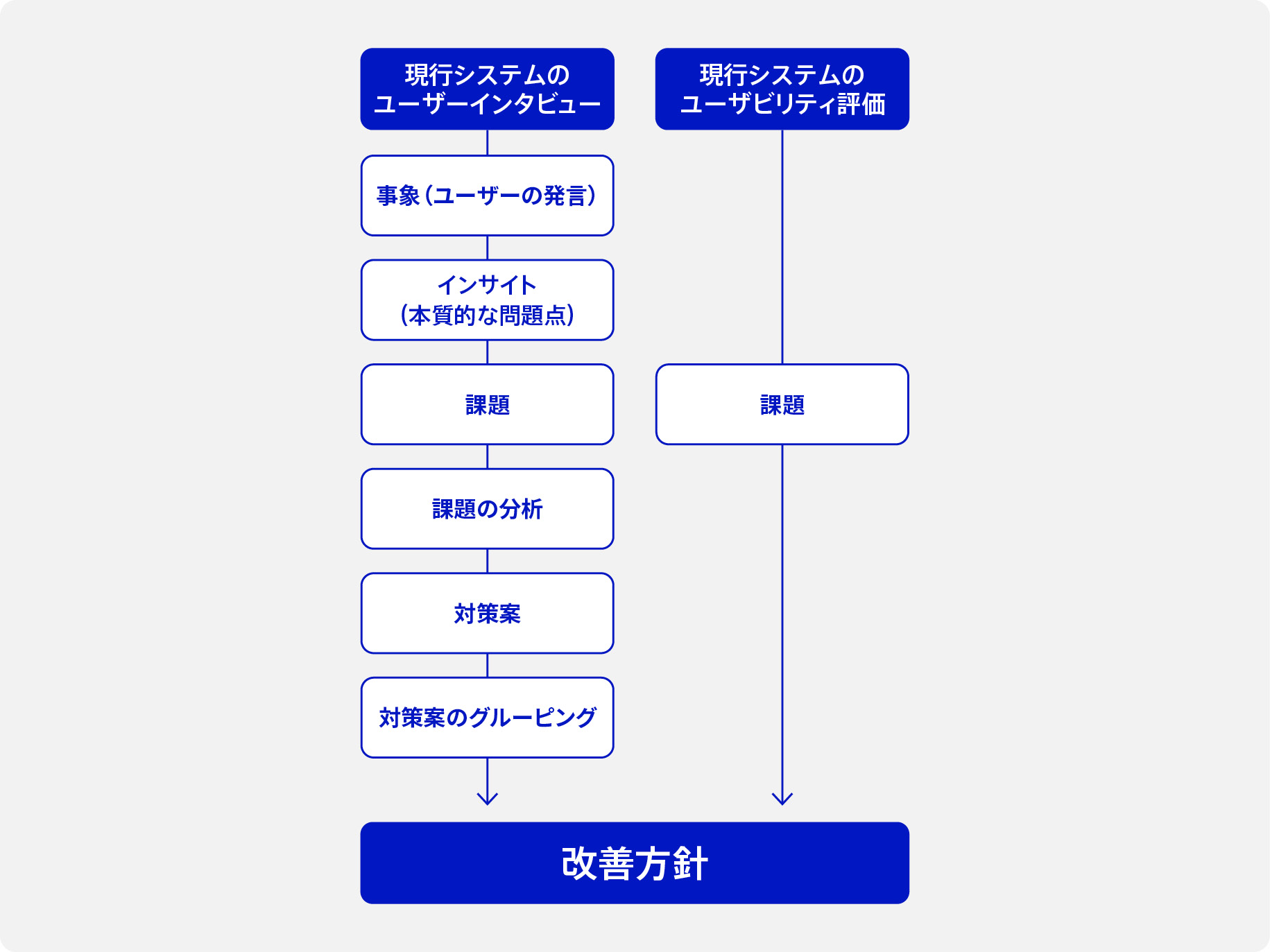
In order to make improvements, we identified already identified improvement requests, grasped the overall picture of the problems that the service had at that time, and specified the scope of the survey. Based on the results, we conducted user interviews with government officials and extracted issues from the user's perspective. In parallel, we also extracted general usability (= usability) issues by human-centered design (* 1) experts, analyzed the severity of each issue in "user interviews" and "usability evaluations," and formulated improvement policies [Figure 1].
In conducting user interviews, the users of the service at that time were broadly divided into "those who draft and approve documents," "document managers," "general document managers," and "reviewers and reviewers (Cabinet Office and the National Archives of Japan)." In addition, we selected the main screens for draft and approval operations, which have a large number of users, and administrative document file management operations, record scheduling (* 2), transfer, and disposal operations, which have been found to have many issues. We conducted interviews with each user and analyzed the results to identify issues and derive improvement policies.
* 1 Human-centered design: A process that focuses on the user of an information system, clarifies the user's environment, user's goals, and tasks, and designs accordingly. An international standard has been established as JIS Z 8530:2021 (a revised standard of ISO 9241-210:2019).
* 2 Records Schedule: Whether administrative document files, etc. shall be transferred to the National Archives of Japan, etc. or disposed of when the retention period expires shall be determined in advance as soon as possible before the expiration of the retention period.
Solution Point 2: User Interviews from a User Perspective
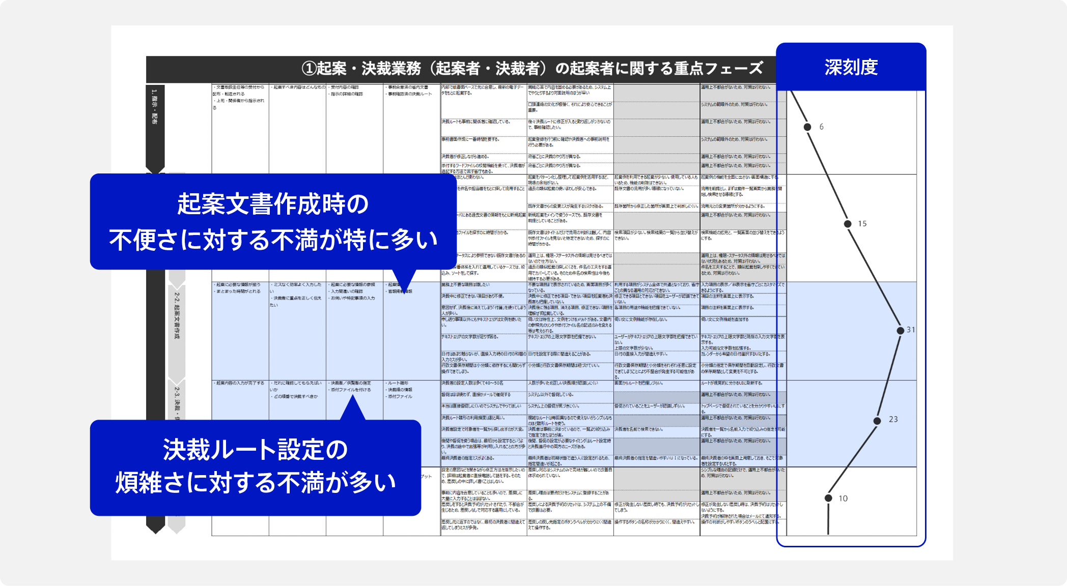
In user interviews, we identified essential issues by organizing and analyzing the statements of officials of government ministries and agencies, and defined and analyzed the issues. In order to obtain effective and efficient opinions, we narrowed down the interviewees to five to six people familiar with "drafting and approval operations," "administrative document file management operations," and "records schedule, transfer, and disposal confirmation and examination operations."
During this process, we conducted an interview with the system at that time, classified and organized the workflow for each operation unit, visualized the severity based on the evaluation of events and problems in each workflow, and identified areas for improvement [Fig. 2].
Solution Point 3: Usability Evaluation from the Experts' Perspective
For the usability evaluation, we conducted an evaluation based on the "Ten Principles of Usability," which are general indicators, in light of the empirical rules of human-centered design experts, and extracted issues related to the usability of the system at that time ([Figure 3] was replaced with text when the HTML version was created).
By categorizing the evaluation results into 10 principles, we were able to identify trends in issues to be improved and take measures for the entire system. In addition, the results of this usability evaluation played an important role in advancing the interviews and improving the accuracy of the hypotheses of the questions.
Ten Principles of Usability
- Know the state of systems
- Adapt to the actual environment
- Give users control and freedom
- Be consistent and driven by standards
- Prevent errors
- I don't have to remember it. I can see it.
- Make flexible and efficient
- Keep design to a minimum and beautiful
- Can recognize, diagnose, and recover from errors
- Provide help and written information
Reference: Nielsen Norman Group. "10 usability heuristics for user interface design". 2024-01-30 (Reference: 2025-03-04)
Solution point 4: Improve accuracy by narrowing down the points to be improved through the prototype verification meeting
Based on the issues derived from the survey so far, we created a prototype screen. To evaluate the usability of the screen, we held a verification meeting for the prototype screen with staff from more than 10 ministries and agencies, which are the main users.
The verification meeting narrowed down the areas that needed to be improved from the opinions and questions received in order to closely check whether the improvement requests of the staff of the ministries and agencies were being met. The issues were those that caused problems in operations across the ministries and agencies, those that were difficult to solve by operating the system alone, and those that affected operational efficiency. Based on the results, the screen design was reviewed and adjusted in a balanced manner so that there was no bias in response to the improvement requests of the ministries and agencies. This process was repeated twice to increase the accuracy of the improvements.
With the aim of forming a consensus by communicating at the same venue with the staff of related ministries and agencies, we are following up by distributing prototype screen drafts to ministries and agencies that were not able to participate.
Solution #5 Design an intuitive screen to navigate without getting lost
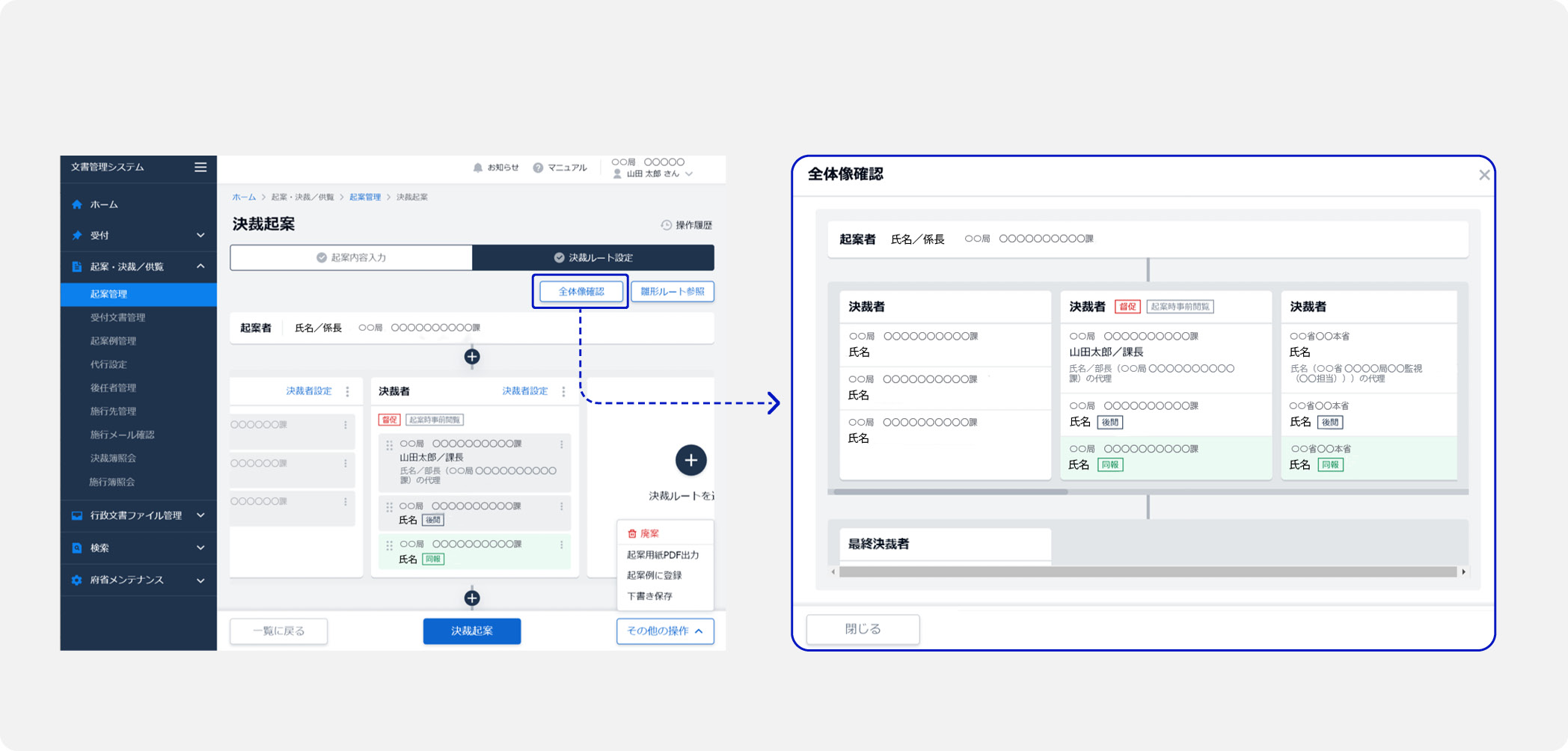
Among the requests for improvement that were raised by the employees of the ministries and agencies who are the users, there was one that said, "I want a system that can tell at what stage in the overall flow of approval and who the next approver is."
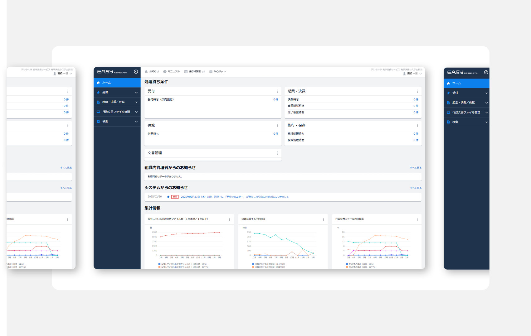
Based on these requests for improvement, we designed a screen to display the approval route [Figure 4]. The screen displays the overall flow of decisions, the progress of decisions, and the next approver in a route format diagram that is easy to understand intuitively. We also added a function to add approvers with a simple operation.
[Issue 2] It was required to be able to continue to use it smoothly even in an organization with many job changes
Ministries and agencies that use EASY are generally subject to personnel changes every two or three years.
As a result, there were concerns that the number of users who use the service for the first time would continue to increase, that there would be individual differences in the level of understanding of the service, and that the handover process would be time-consuming.
Therefore, from a medium - to long-term perspective, we have worked to create a system that maintains high quality so that it is easy for anyone to use and can be used smoothly by new users.
Helpful Documentation
- DS-671.1 Usability Introduction Guidebook - 4.2 Problems to be solved in usability design activities
Solution point 1 Training for learning how to operate EASY and providing an operating environment for practice
EASY is a service that is limited to employees of government ministries and agencies. In other words, unlike other services for the general public, it is possible to have direct contact with users.
Focusing on this characteristic, we are actively conducting training for officials of ministries and agencies in cooperation with Cabinet Office. We carefully explain everything from the rules for public document management to the specific operating methods of EASY to support the understanding of officials of ministries and agencies as users and the smooth use of services. We also provide an operating environment for practice that can be used freely at any time by officials of ministries and agencies who want to learn how to operate EASY.
Solution 2: Establish design guidelines to ensure continued ease of use
No matter how ingenious a service is, it will need to be adjusted and improved over time. If the design policies for the screens and experiences that users touch become blurred, sustainable usability cannot be guaranteed.
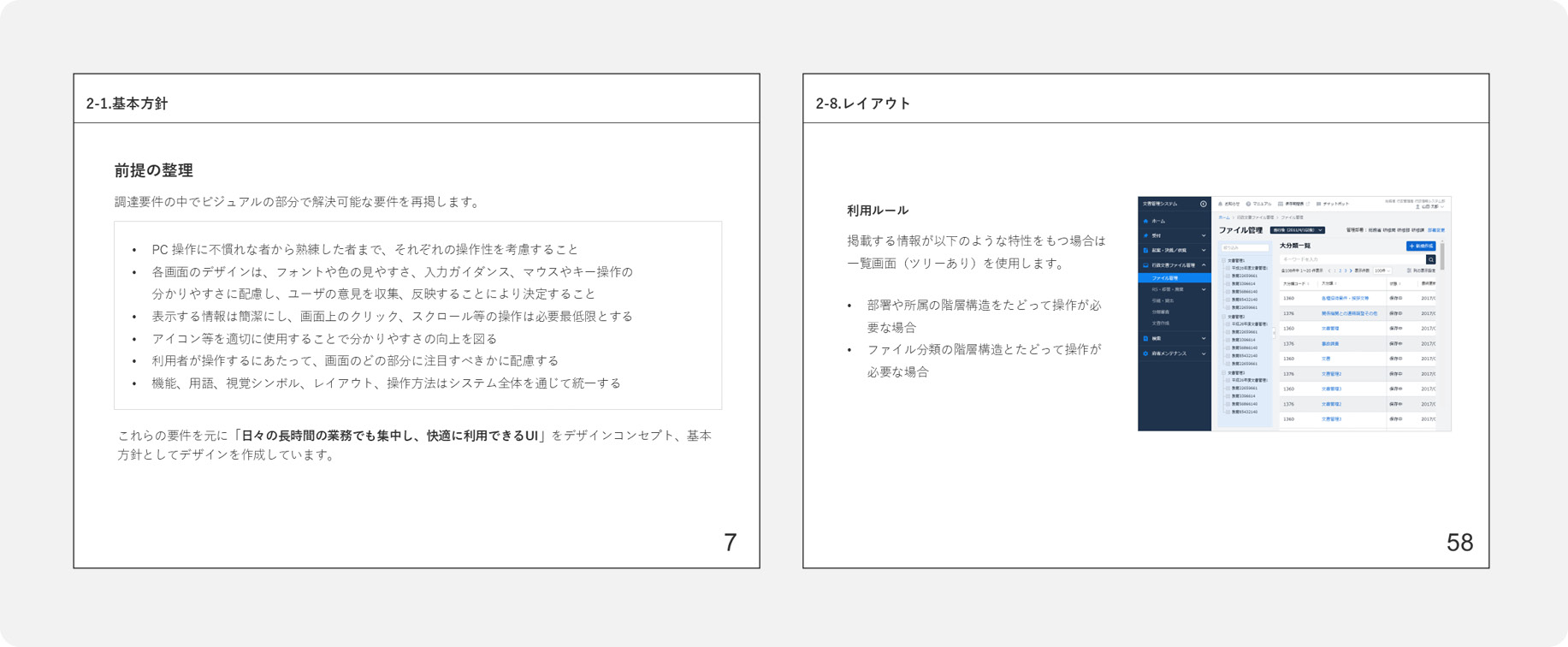
For this reason, we have created design guidelines that summarize the design policies that should be followed [Figure 5]. The design guidelines stipulate the design policies for EASY screens and experiences in an easy-to-understand manner, such as "Be based on rules such as specified colors and font shapes," "Allow staff who are not familiar with the service to operate it," and "Consider cases where it will be used for a long time," to ensure continuous usability.
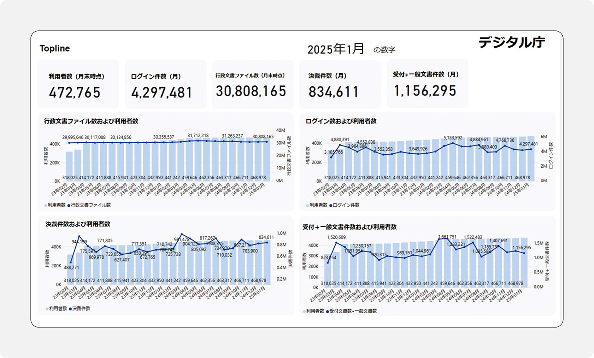
Solution point 3: Utilize the "Policy Dashboard" to observe service usage data
In order to continue to provide high usability and convenience to users, we make effective use of the "Policy Dashboard," which collects and publishes policy-related data [Figure 5]. It makes it possible to observe the number of users, the number of logins, the number of administrative document files held, the number of decisions, the digitization rate, etc. for each ministry and agency and for the total.
The policy dashboard is used for a variety of purposes, including "checking the rate of increase in use over time for use in future system enhancement plans" and "checking the status of use during busy periods to prepare for operations and maintenance and help desk activity."
In the past, using spreadsheet software, it was possible to roughly grasp that the busy period for official document approval was at the end or beginning of the fiscal year, but not to analyze detailed movements. However, since using the Policy Dashboard, it has become possible to visually confirm trends in graphs and other formats in an easy-to-understand manner, making it possible to analyze in detail the movements of each government agency. For example, while many government agencies increased their use from March to April, National Tax Agency's use increased from March to April to June and July, and MHLW's use increased in October, making it easier to grasp trends.