Example 3: Digital Agency Website
- Last Updated:
The "Digital Agency Website" is an official website established in conjunction with the establishment of Digital Agency in September 2021. It aims to deliver necessary information accurately and carefully to users in Japan and overseas. It places the highest priority on web accessibility and implements advanced measures as a government website, such as the introduction of a design system as a mechanism to provide information consistently to the public. In November 2023, the website was renewed based on feedback from users. In addition, the content management system is being developed based on open source and continuously improved while collecting opinions from users so that it can be deployed to each government agency.
Table of Contents
- [Problem 1] It was difficult to find desired information from the top page
- [Problem 2] Contents were not configured so as to be easily understood
- Interview
- Related Pages
[Problem 1] It was difficult to find desired information from the top page
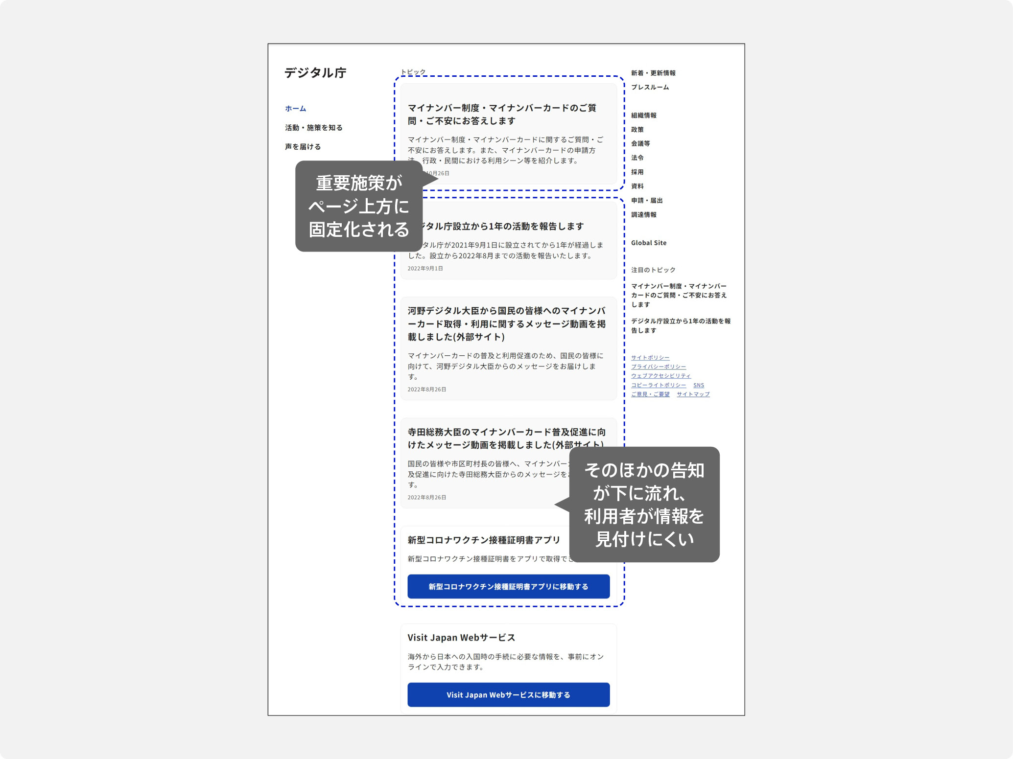
After checking the statistics of the Digital Agency website before the renewal, it was found that many of the users arrived at the target page directly from search engines.
The main factors were that the information on the top page was displayed in time series, that important measures were fixed at the top of the page, and that the guidance for users to find the information they wanted did not function sufficiently [Figure 1].
In addition, as the operation continued, it became clear that the consistency of the increasing amount of content could not be maintained and that information was scattered in various places, and it was decided to review the overall design.
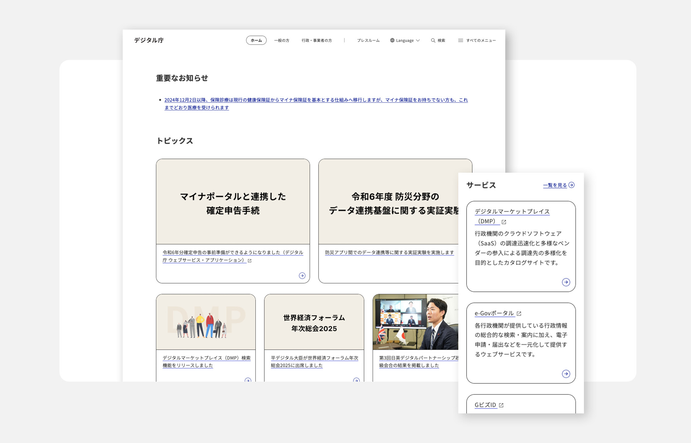
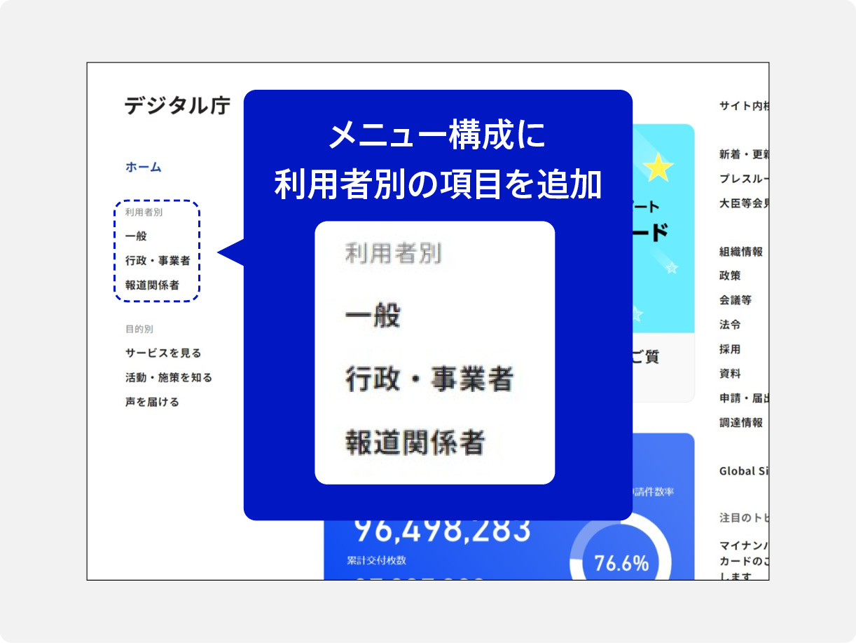
Solution point 1 Classify users into three groups and optimize the flow of information provision
The website users were divided into three groups: "the general public," "government and businesses," and "members of the press." As a result of a survey of each group of users, we were able to see the differences in the content that interested them.
Based on the results of this survey, we first made improvements to the menu structure by adding items for each user, organizing links to content for each user menu, and separating the displays [Figure 2]. In order to confirm the appropriateness of the user menu display, we started with menu improvement, checked statistics, and verified the effects, and then developed the results into the overall structure of the renewal.
Solution point 2 Establishment of rules to make it easier to find the latest information
Before the renewal, the top page consisted of "Notifications" stacked vertically. However, when information was stacked, the page became vertically long, and users had to scroll to find the information they wanted, causing them to be unable to find the information they wanted.
Therefore, at the top of the top page, we have established a rule to post the latest information, such as those related to policies and measures, that are of high importance in descending chronological order of the content of two large horizontal notifications and three small horizontal notifications below that, for a total of five notifications [Figure 3].
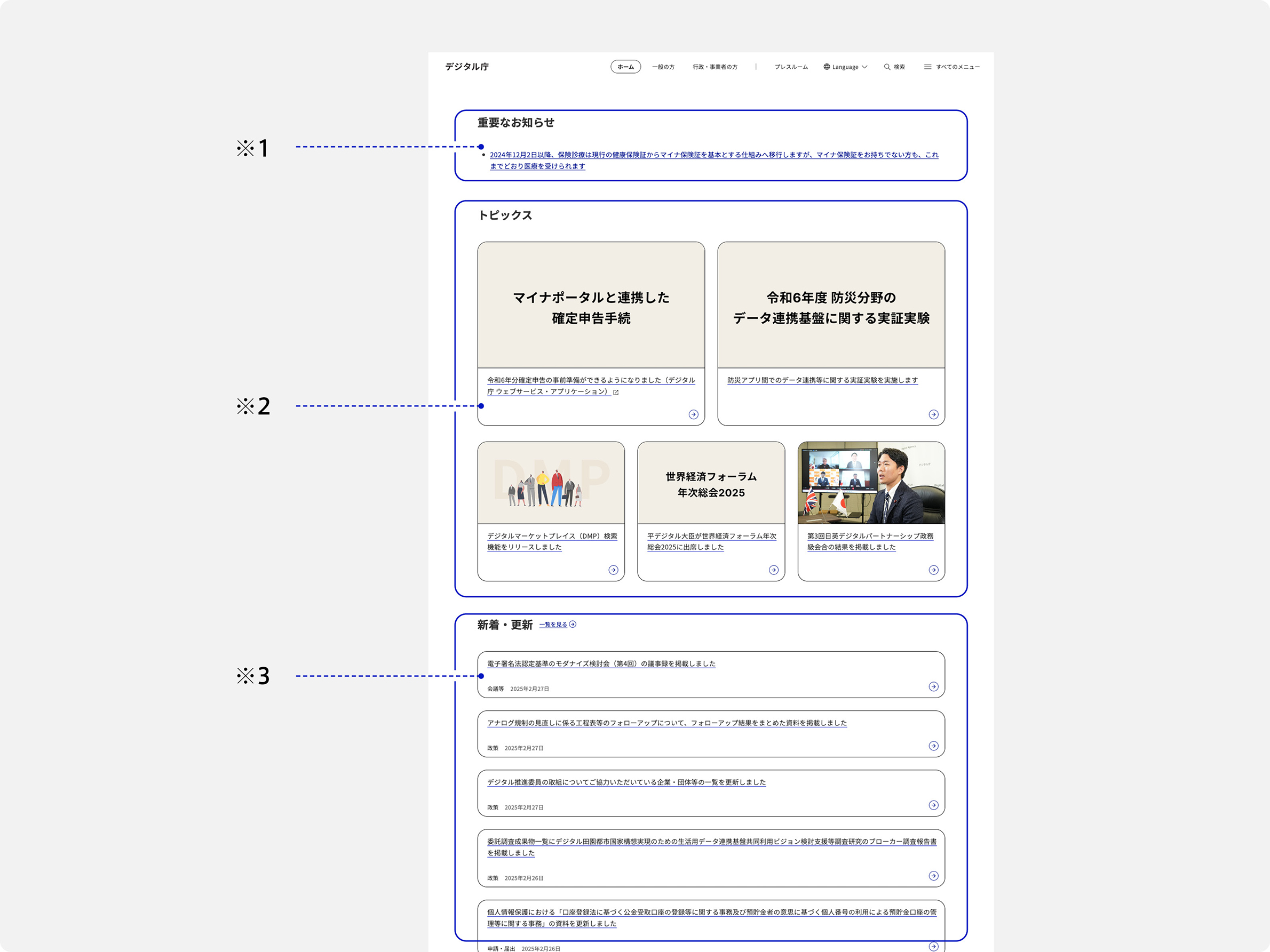
* 1 Important Notice
- Notifications of high urgency and importance, such as incidents
- Number: Up to 2
* 2 Topics
- High Priority
- Number of cases: Five cases in principle * Two to four cases can be handled.
※ 3 New / Updated
- Daily new and updated information
- Number of cases: 5
[Problem 2] Contents were not configured so as to be easily understood
There were also various issues regarding the composition of the content to be transmitted.
For example, sentences written in accordance with administrative rules and customs were often difficult for users to understand, and it was unclear whether necessary information was being delivered to users.
In addition, even if general opinions and requests were collected, there were many contents for the entire policy and the entire Digital Agency, and it was difficult to see whether the contents had been communicated to users, so improvements were made from various angles.
Helpful Documentation
- DS-671.1 Usability Implementation Guidebook - 3 Understanding Design Principles
- DS-671.2 Web Accessibility Deployment Guidebook - 3 What to Achieve with Web Accessibility
- Use of "DS-672.1 Guidebook for Web Accessible Publicity" - 5.1 Content Checklist
Solution point 1 Creating a system to transmit information that is easy to communicate by the government officials themselves
In the field of administration, when sending out content, as in daily work, there is a custom of using technical terms and expressions peculiar to the administration, and describing all the details, so there was a tendency for it to become difficult for users to understand.
In order to solve these problems, at Digital Agency, staff in charge of managing website content check each content from the perspective of users who are not familiar with policies and laws. The checked contents were shared with the staff in charge of content, and after several exchanges, a flow to complete the manuscript was created.
In addition, from the perspective of information design, we have established check items on how to write content, such as "Does the heading correspond to the main text, and does the subject correspond to the predication?" and "Is a sentence too long?" In addition, from the perspective of accessibility, we have established rules, such as "Be sure to attach alternative text to images," and "When publishing PDF, prepare an HTML-version that is easy to read by screen readers as much as possible." By setting and sharing these criteria, government officials itself has created a system that can transmit information to users.
Solution point 2: Create a system that incorporates user opinions and makes improvements
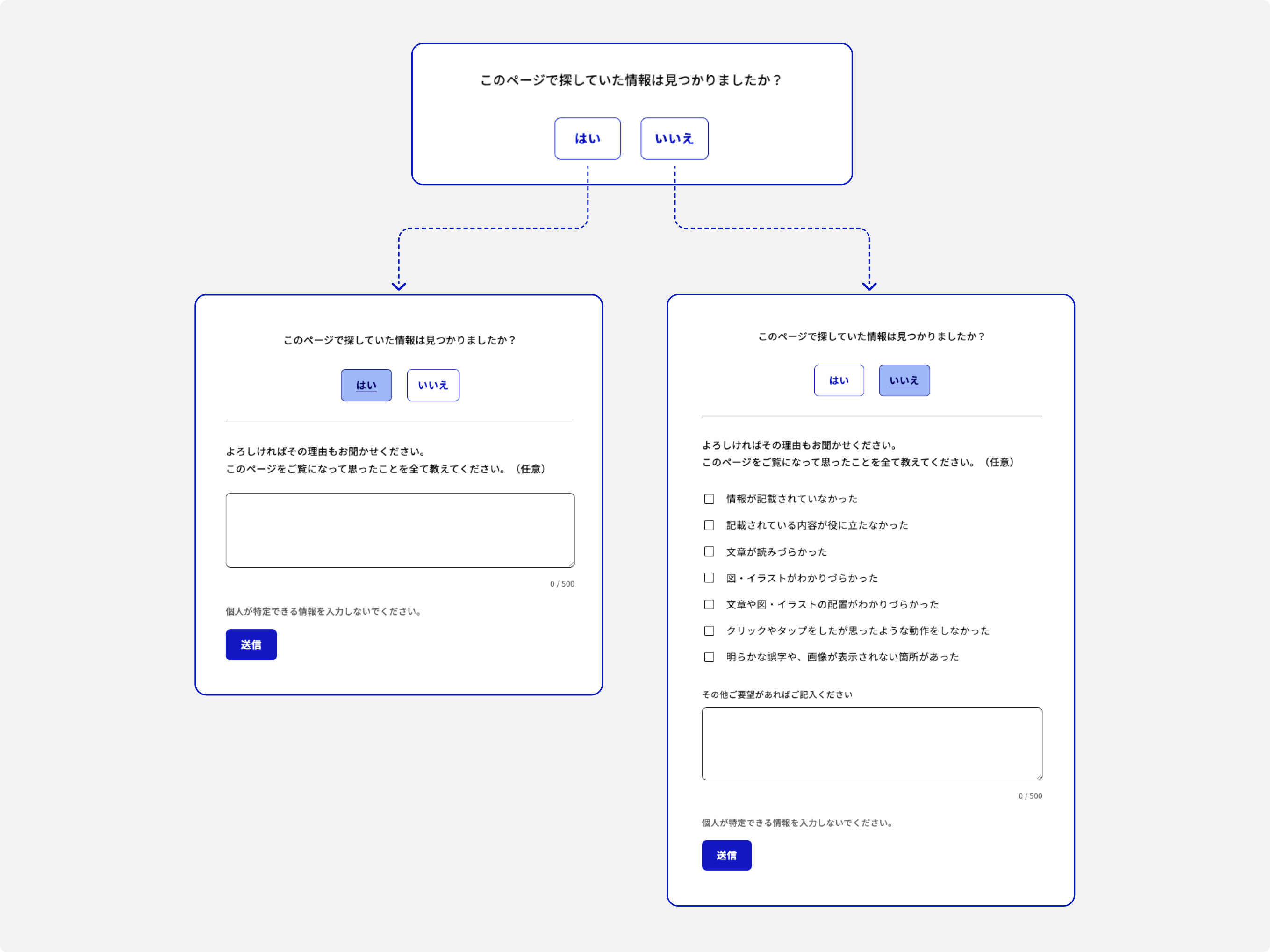
In order to accurately disseminate information, it is essential to understand what kind of impressions and opinions users actually have about the content. Therefore, we have implemented a posting function (hereinafter referred to as "Feedback Form") on the content page to gather user opinions.
In this feedback form, we took care to reduce the burden of answering in order to gather more opinions. With the advice of user research experts in Digital Agency, we set up a "yes / no" button to quickly confirm whether users found the information they were looking for [Figure 4].
If "Yes" is selected, the reason can be entered in a free text box. If "No" is selected, the reason can be selected from a list of choices and a supplementary explanation can be entered. These features are designed to make it easier for users to respond and to gather the necessary information.
On the other hand, the number of PVs (the number of pages viewed by users) is shared with Digital Agency on a weekly basis based on the access status of the website. By combining these results with the opinions collected from the feedback form, it is possible to grasp the specific content that users want to know and their actual behavior on the website, which would otherwise be known only through face-to-face interviews.
"Among the pages with many negative opinions, we gave priority to those that were viewed the most, and reviewed the content. By arranging the headings and providing information needed by users, the percentage of" "No" "was high on some pages at first, but the percentage of" "Yes" "increased after the improvement. In addition, we made improvements such as using images to effectively express information that would be difficult to understand if it were read in writing."