Using the Color Palette
- Last Updated:
In order to contribute to quality improvement and design efficiency in dashboard development, Digital Agency has published a design template (for Power BI) for dashboard development. This page introduces how to use the seven color palette provided.
Table of Contents
- 1. Configure Color Palette
- 2. Solid Gray
- 3. Blue
- 4. Light Blue
- 5. Cyan
- 6. Green
- 7. Orange
- 8. Red
- 9. Important Points
1. Configure Color Palette
Text
Base color of the text used throughout the dashboard
- Text (Black): the color to use when the background is light
- Text (White): the color to use when the background is dark
- Label: Color used for supplementary text, such as labels, notes, and additional information.
- Link: Color used for link text
Background:
The color used for the background of elements such as charts, tables, and filters
- Standard: The base color used for the background of content areas such as metrics, charts, and tables.
- Highlight: The color used as a background for indicators and important information that you want to highlight
- Control: The color used for the background of user-driven UI elements such as filters.
Chart
The color used to represent a data series in a chart, such as a bar or line chart
- Primary - The primary colour used to indicate key data on a chart
- Secondary: A secondary color used to highlight or differentiate multiple series.
- Neutral: A neutral color used to show data or things to be compared that do not need to be emphasized
Semantic Color
Colors used to indicate the increase / decrease of numerical values, achievement of targets, errors, etc. in an intuitive manner
- Positive: The color of a positive change, such as an increase in numerical value.
- Negative: Color indicating a negative change, such as a decrease in a number
- Success: Color indicating that the condition is satisfied, such as a target value.
- Error: Color indicating a condition requiring attention or warning, such as target not reached or error.
2. Solid Gray
Dashboard Image
Solid Gray dashboard image. 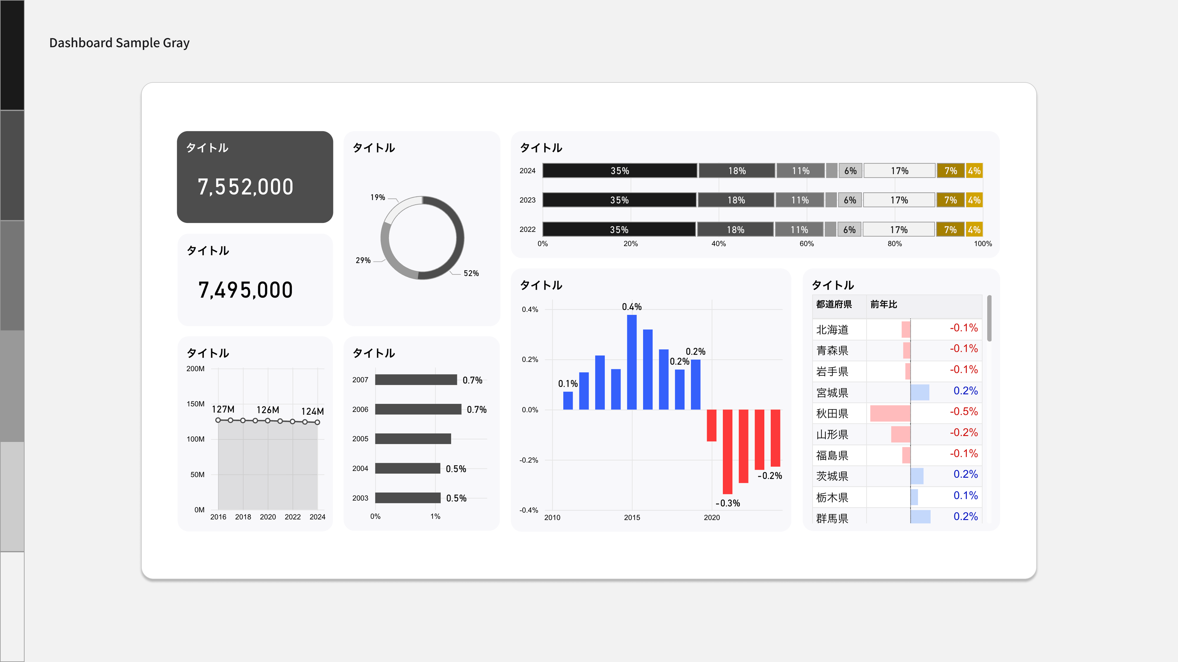
Color Palette
Color palette with Solid Gray as the key color. 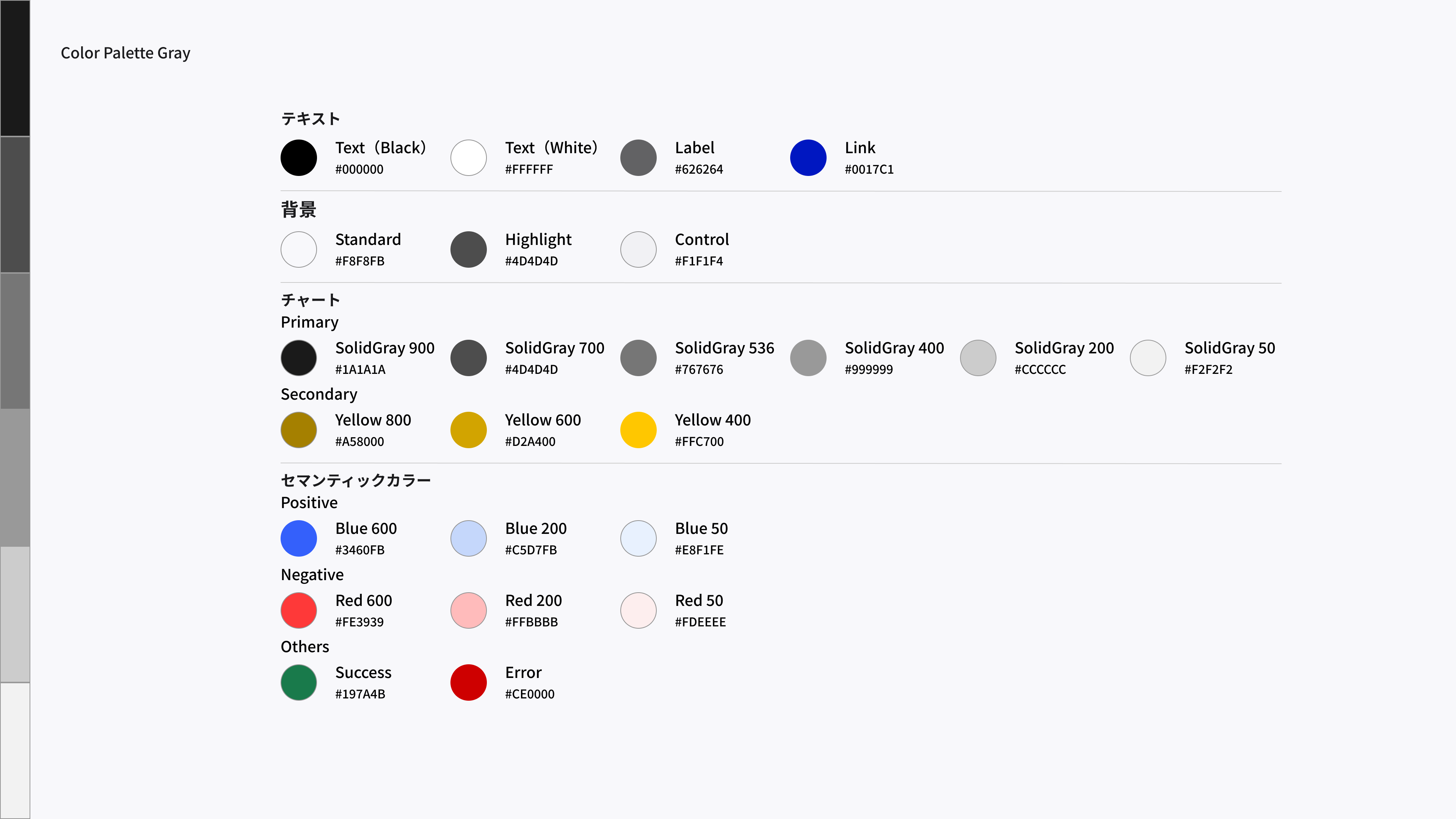
Design Templates (Power BI)
Solid Gray design template.
3. Blue
Dashboard Image
Blue dashboard image. 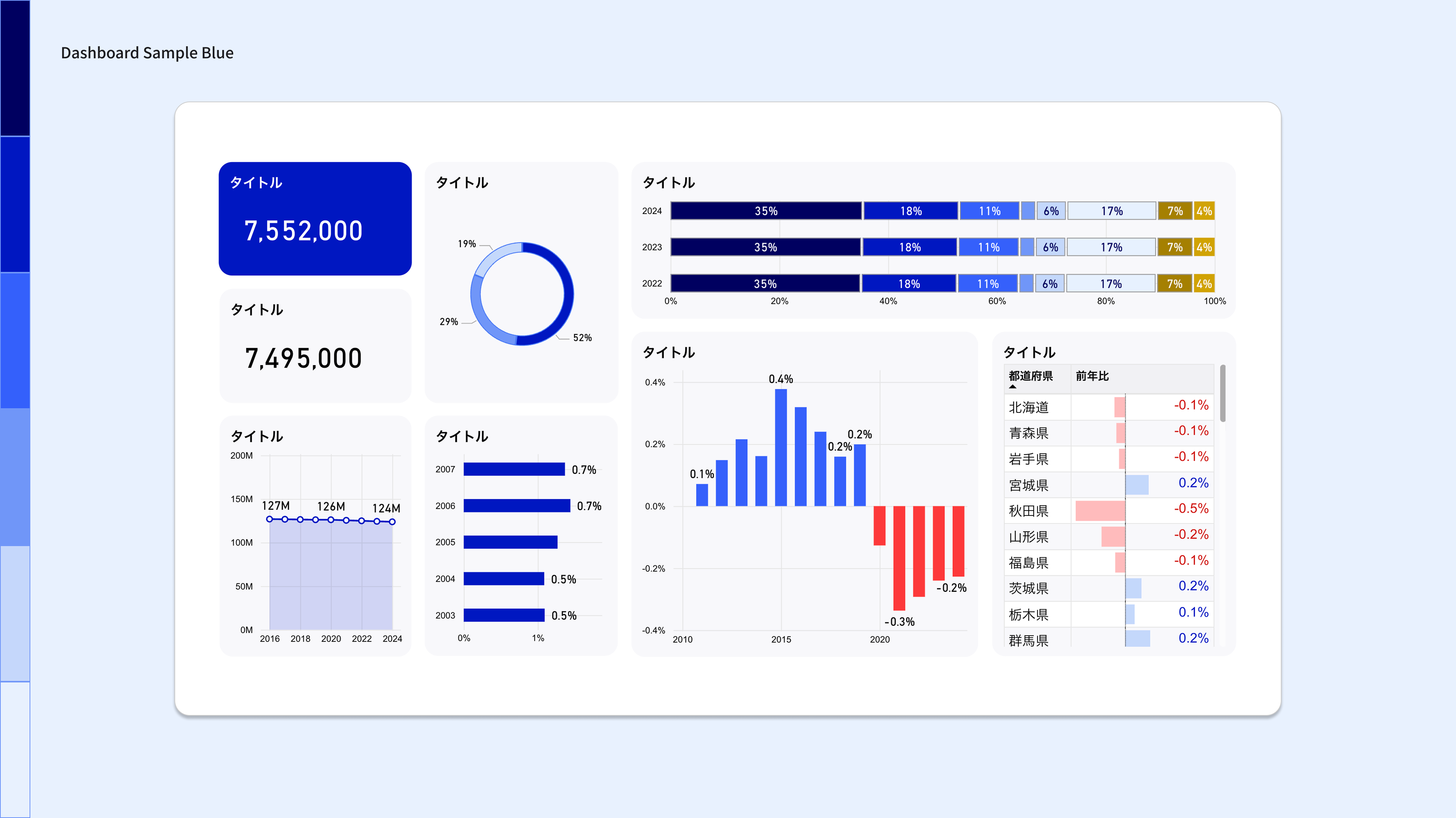
Color Palette
A color palette with blue as the key color. 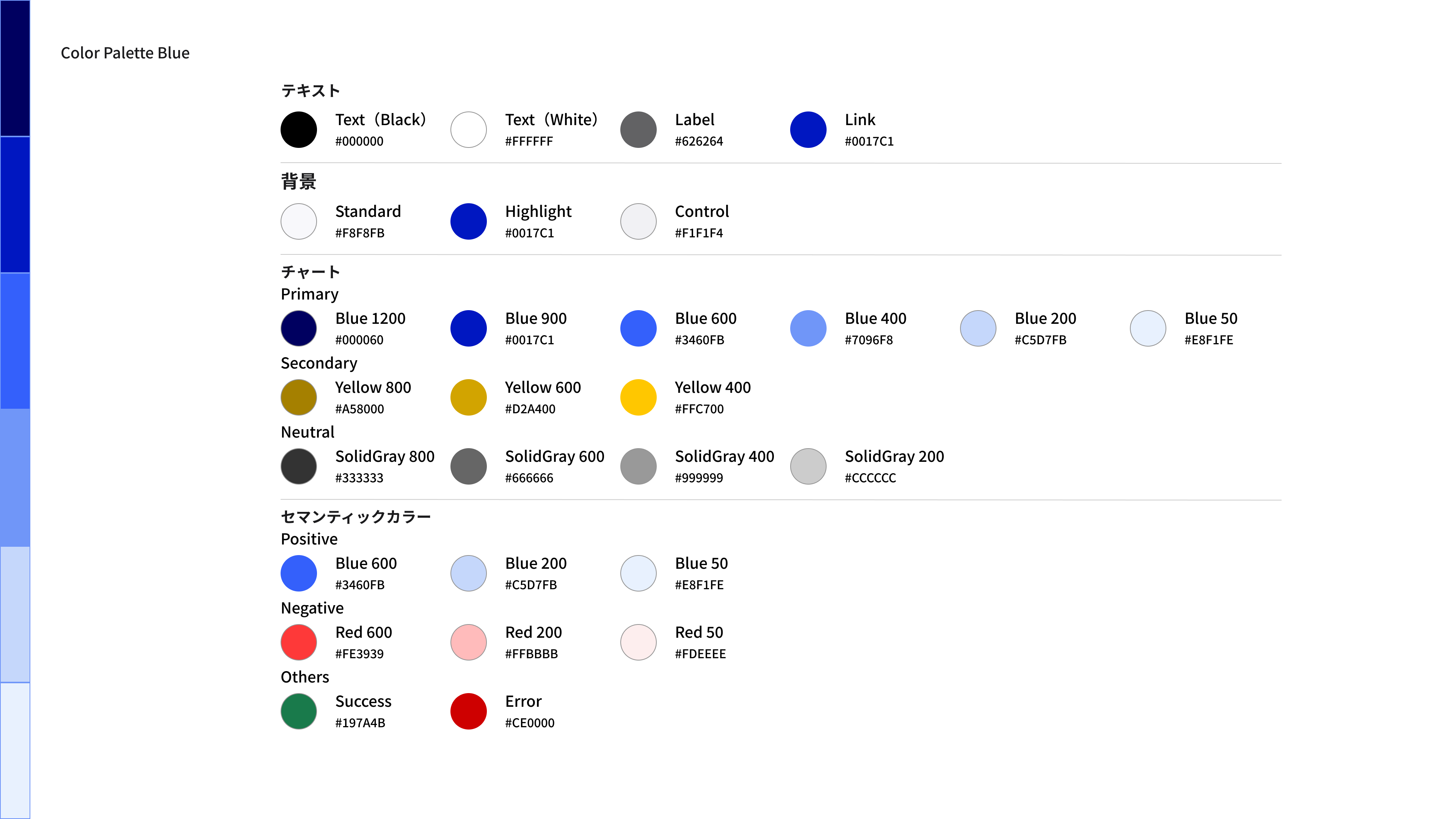
Design Templates (Power BI)
Blue design template.
4. Light Blue
Dashboard Image
Light blue dashboard image. 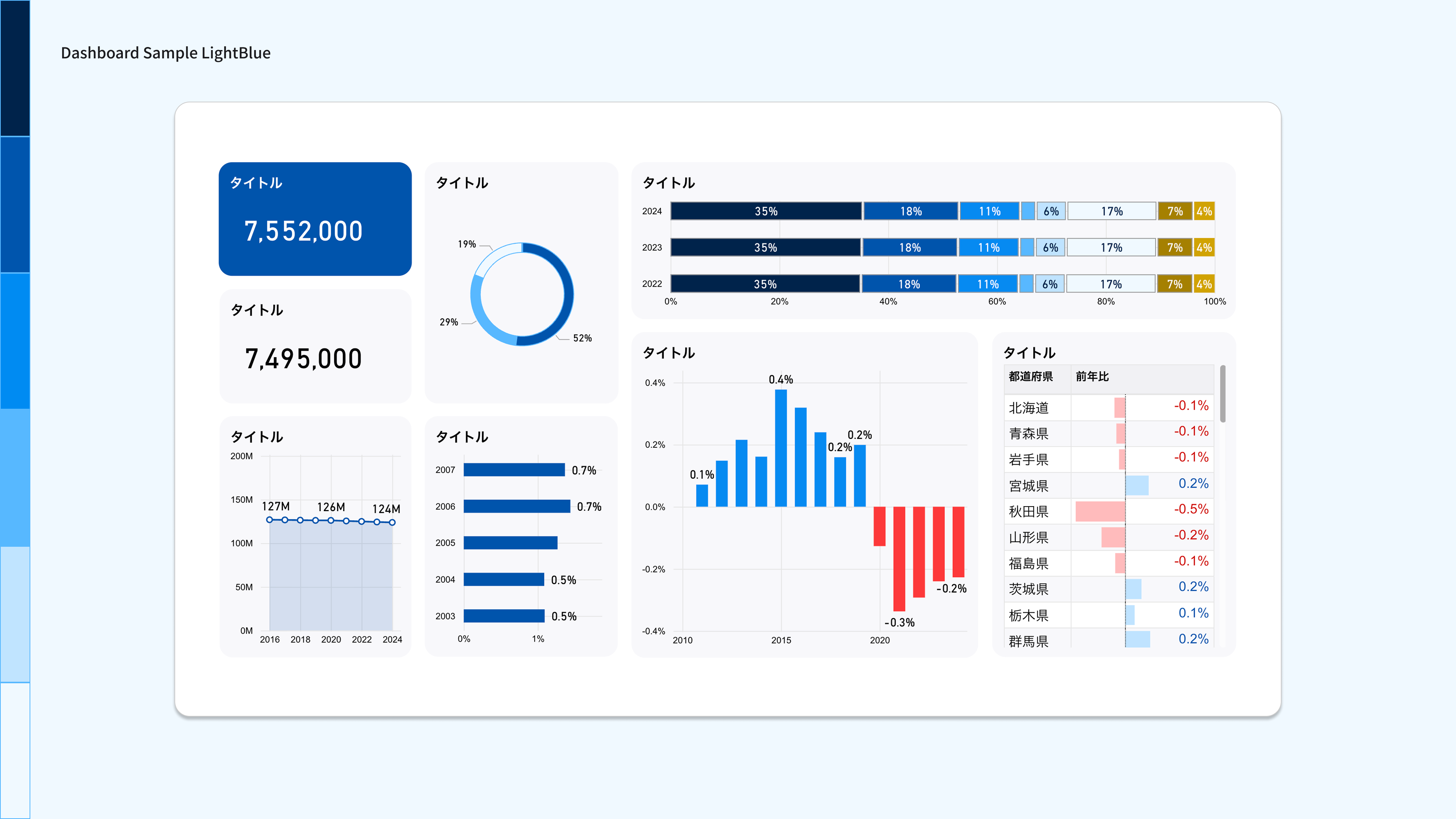
Color Palette
Color palette with Light Blue as the key color. 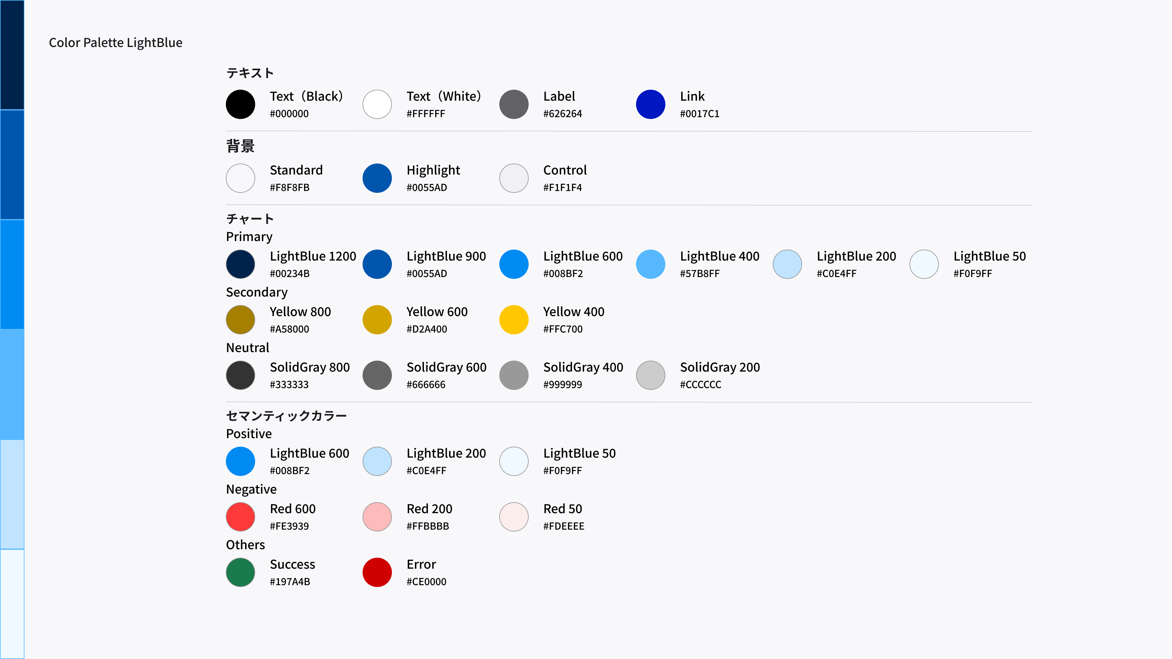
Design Templates (Power BI)
Light Blue design template.
5. Cyan
Dashboard Image
Cyan dashboard image. 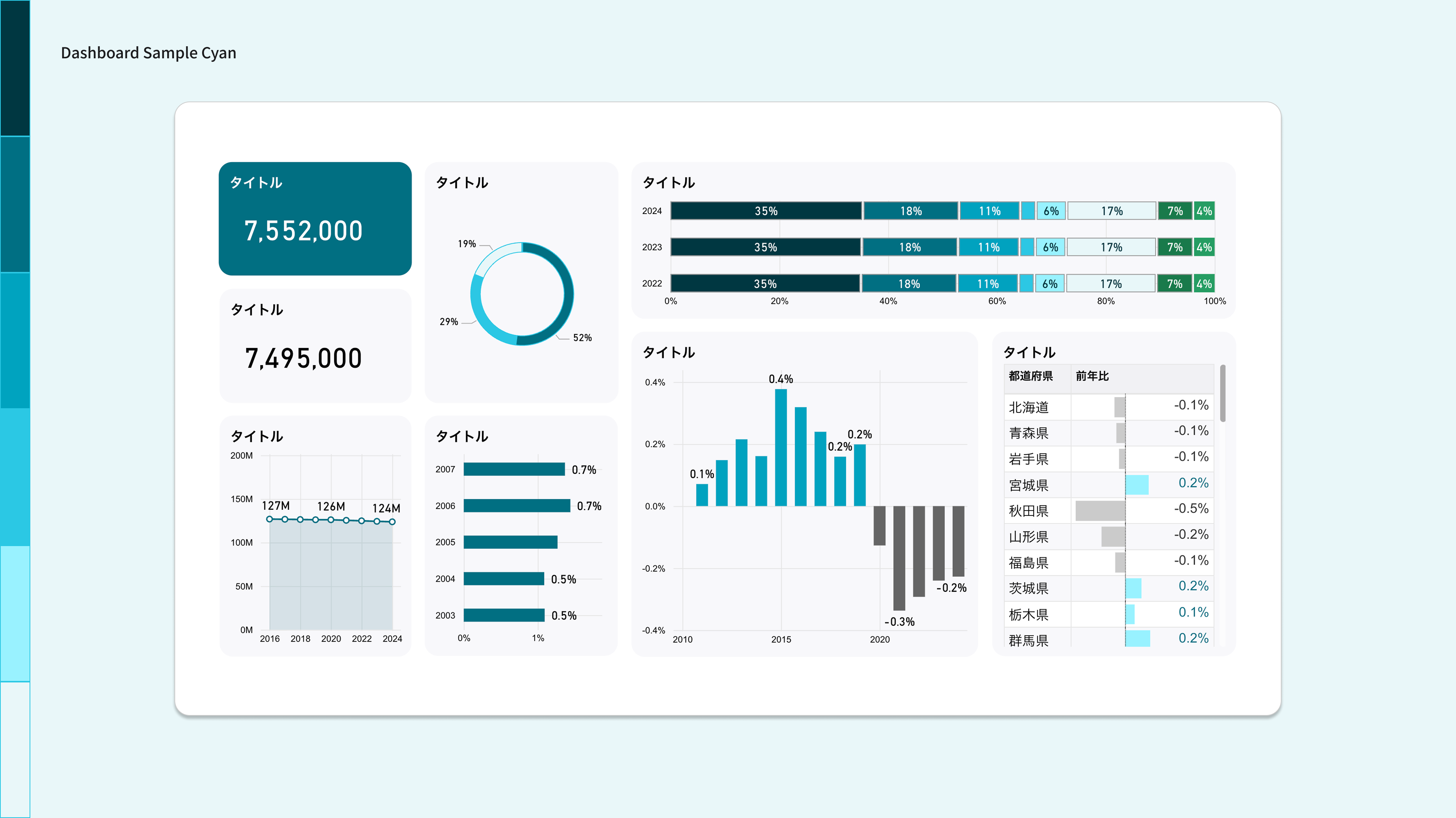
Color Palette
A color palette with cyan as the key color. 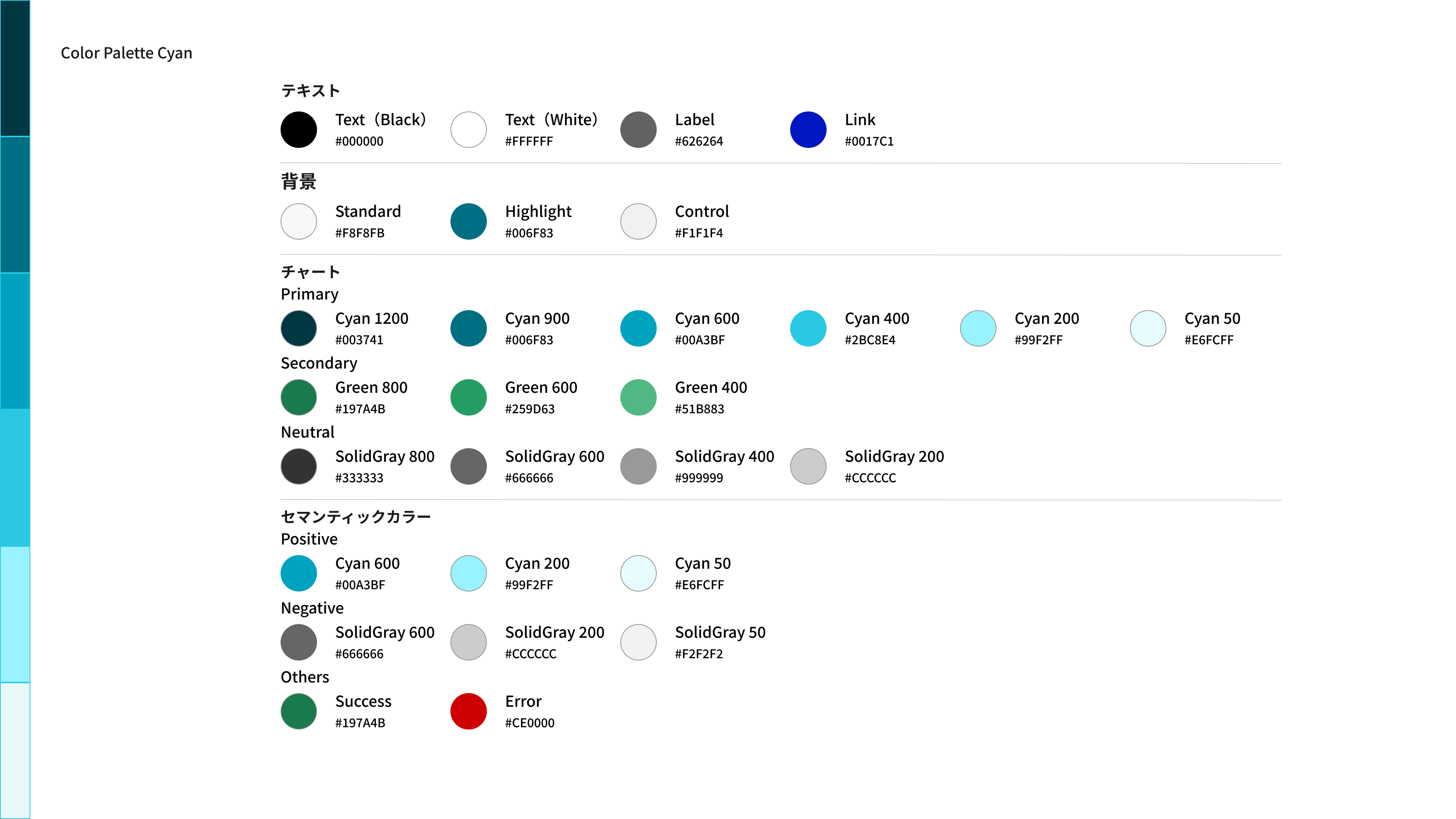
Design Templates (Power BI)
This is a cyan design template.
6. Green
Dashboard Image
Green dashboard image. 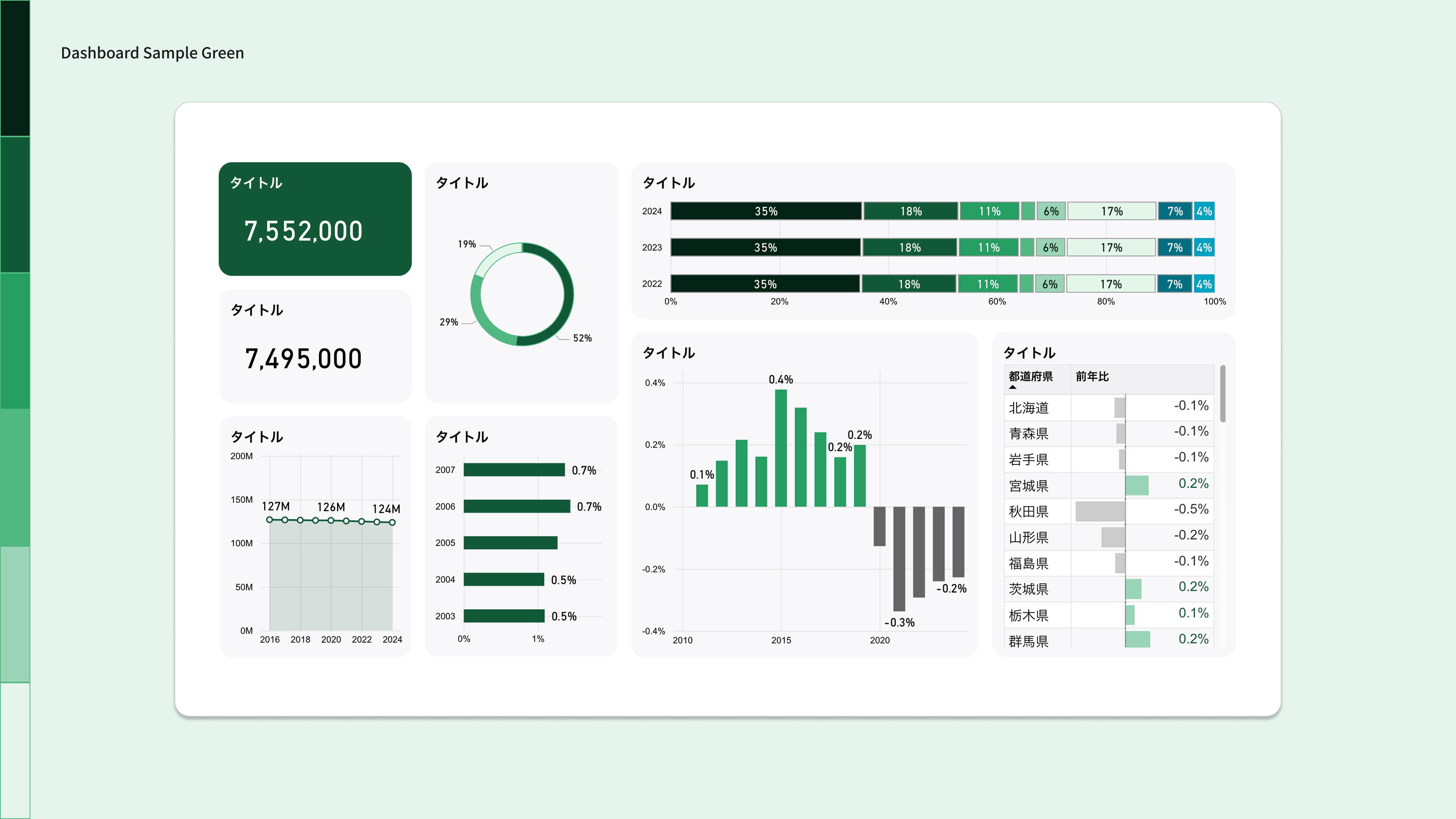
Color Palette
A color palette with Green as the key color. 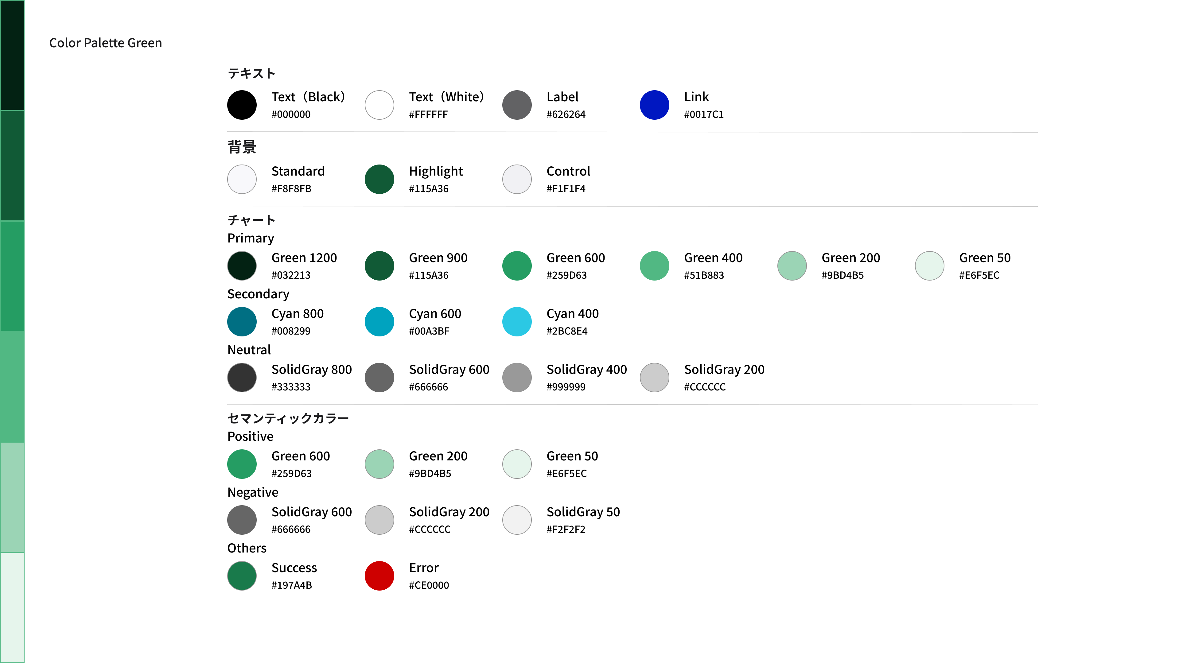
Design Templates _ (Power BI)
Green design template.
7. Orange
Dashboard Image
Orange dashboard image. 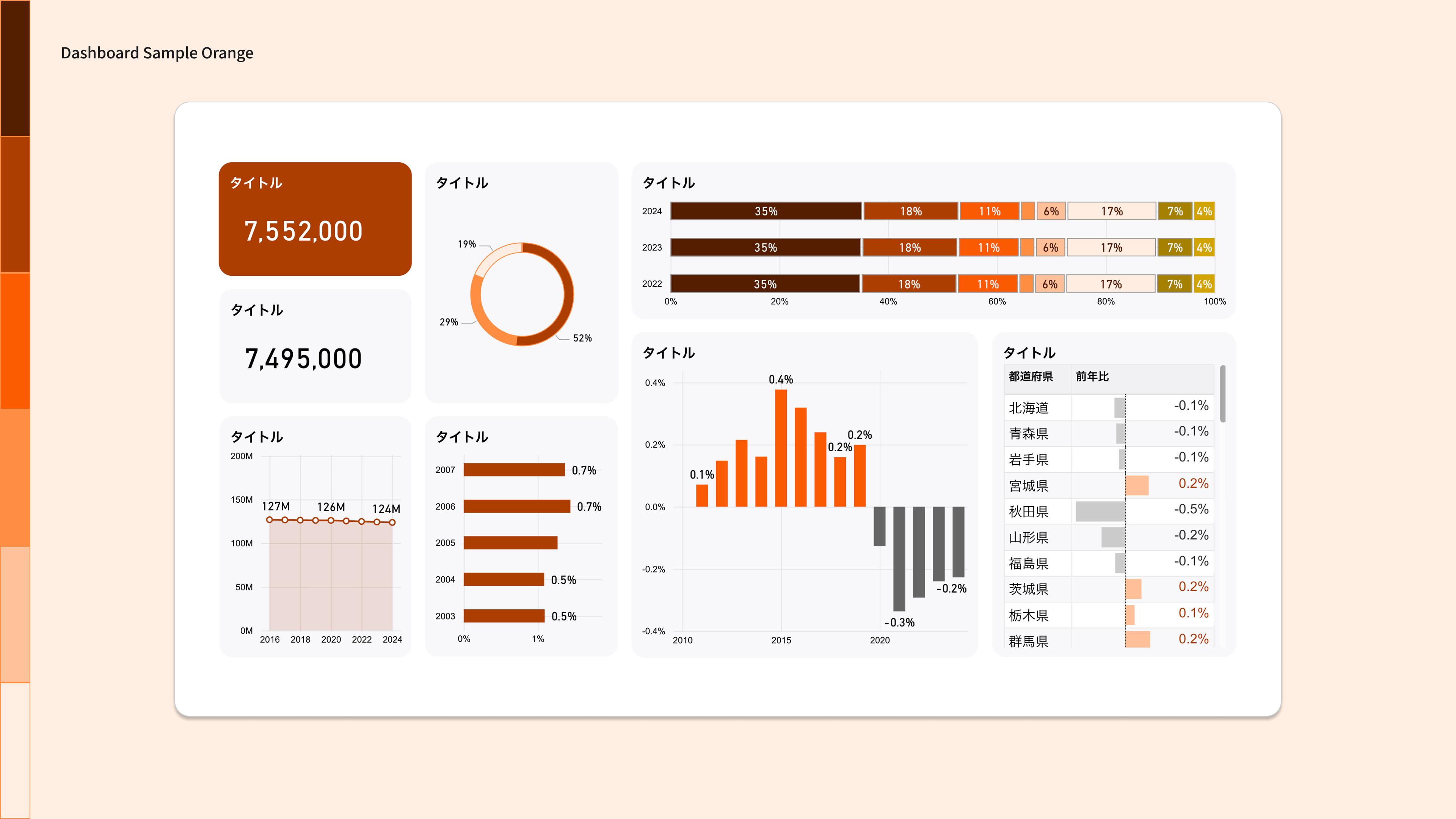
Color Palette
A color palette with orange as the key color. 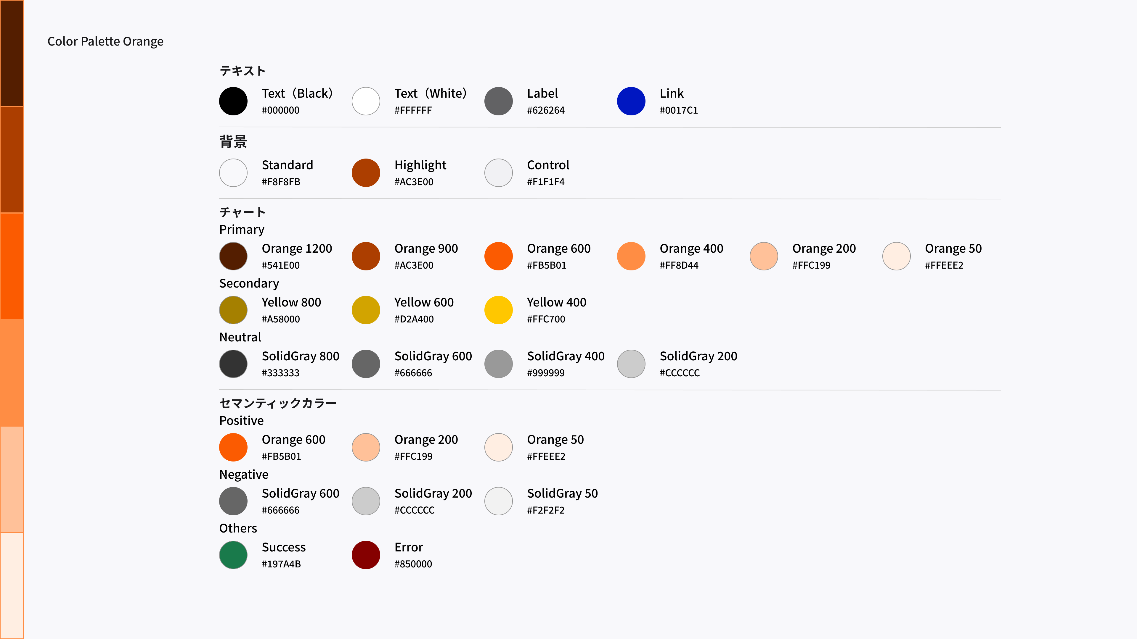
Design Templates (Power BI)
Orange design template.
8. Red
Dashboard Image
Red dashboard image. 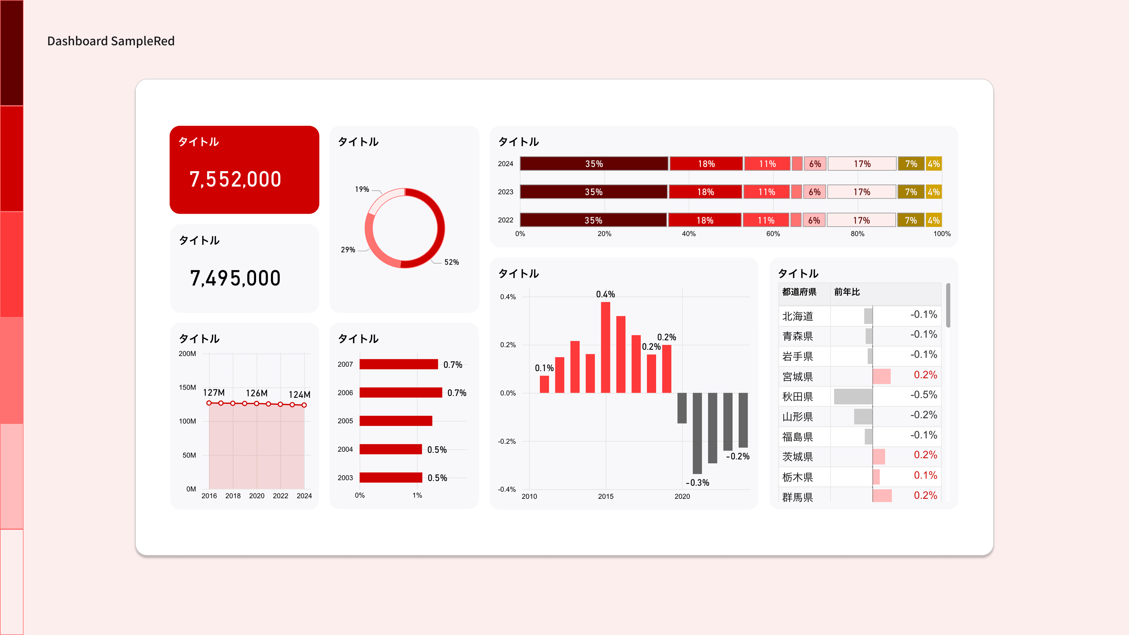
Color Palette
A color palette with Red as the key color. 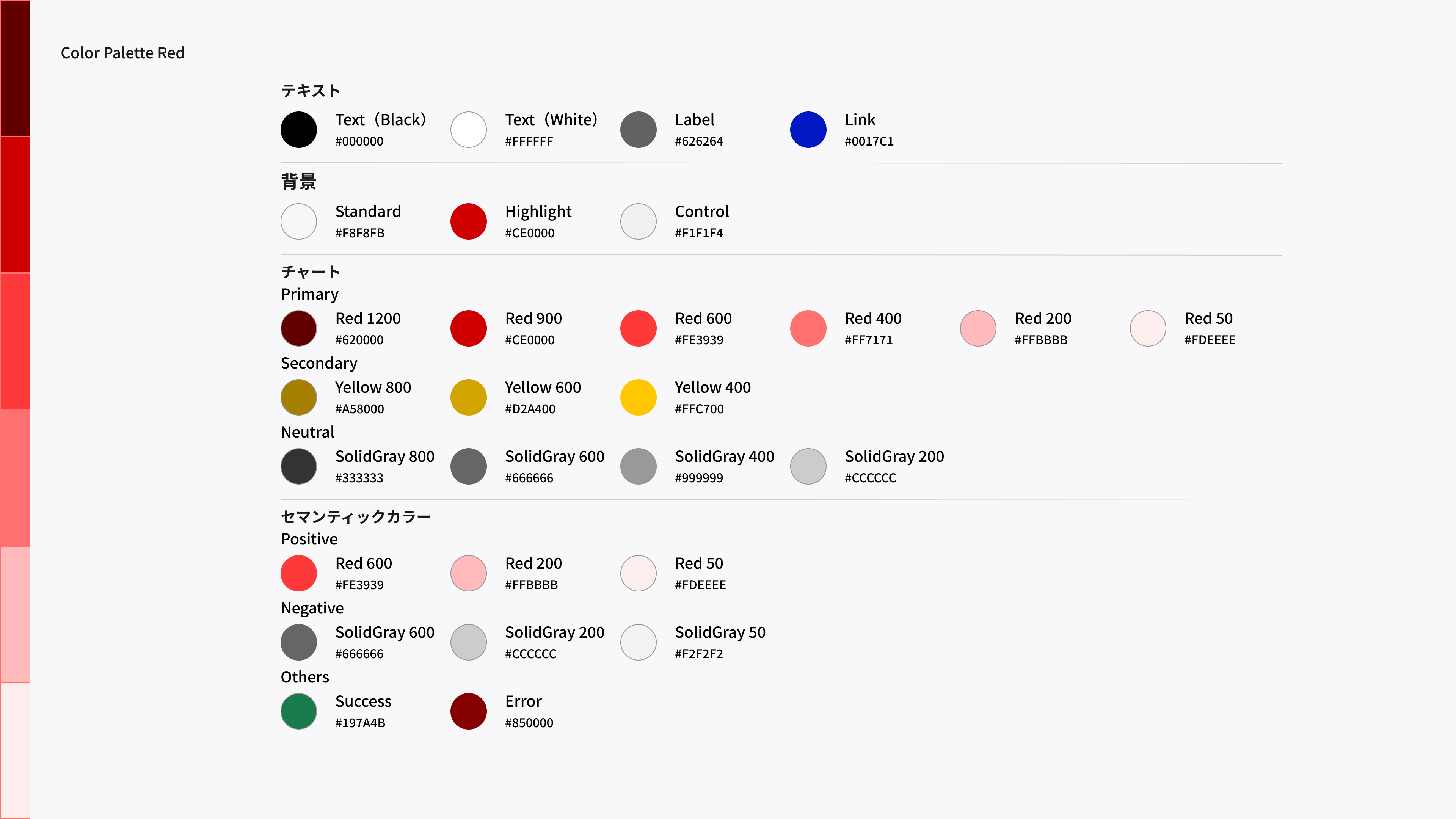
Design Templates (Power BI)
This is a Red design template.
9. Important Points
Only 10 colors are set in the color palette
The color palettes in the design templates contain only the 10 most commonly used colors for dashboard designs. If you want to use additional colors, use the colors listed in the color palettes for your reference.
Conforming to the Digital Agency Design System
The colors used in each color palette conform to the Digital Agency Design System color palette. If you want to use a color that is not included in the color palette, refer to the Digital Agency Design System color palette.
Need to be designed for accessibility
To make the dashboard easy for everyone to see and use, you need to meet contrast requirements and consider color vision diversity. Use the color palette as a guide, while considering the contrast ratios between text and background and the appropriate color combinations. For specific ideas, see Color accessibility in the Digital Agency design system.
, comments and requests,
Please send any questions or ideas from , comments and requests, .