Dashboard Design Practitioner Guide and Design Templates
- Last Updated:
In order to contribute to quality improvement and design efficiency in dashboard development, Digital Agency has published a practical guidebook and a design template for dashboard development (for Power BI).
Updates
- July 17, 2026 Updated the color codes in the color palette
- May 29, 2026 Application Examples A collection of application examples ( News) of the "Practical Guidebook and Design Template for Dashboard Design" was published in Digital Agency.
- March 31, 2026 Dashboard Design Practical Guidebook and Design Template Officially Released
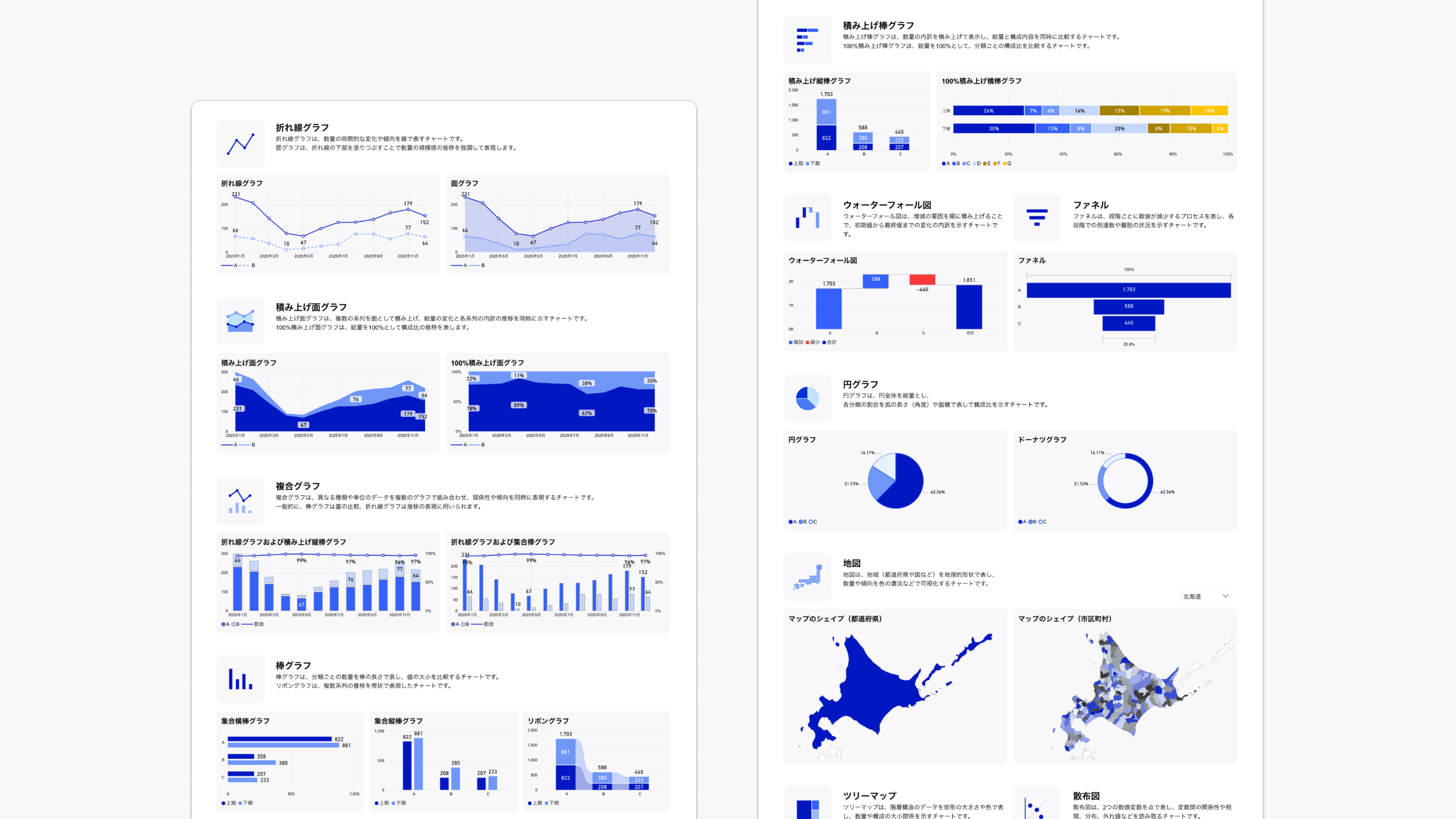
- Design template with 7 color palette, map, navigation buttons and more
Table of Contents
- 1. Purpose of Disclosure
- 2. Features of the Practical Guidebook
- 3. Download Practical Guidebook
- 4. Template Characteristics
- 5. Download Template
- 6. Design Application Examples
- 7. Examples of Utilization
- 8. comments and requests
1. Purpose of Disclosure
TMG is taking the lead in promoting data-based and evidence-based visualization of policy decisions and effects within the Government of Digital Agency. As part of this, TMG is providing practical guidebooks and other materials so that government, public institutions, and private companies can efficiently develop easy-to-understand dashboards. By making data easily visible, we aim to establish a correct common understanding among many stakeholders, improve the quality of decision-making, and lead to better actions.
The Practical Guidebook has been compiled and systematized to reflect the opinions of Digital Agency and experts in the private sector on dashboards and data-visualization, in addition to the knowledge gained in developing the Japan Dashboard and the Policy Data-Dashboard , which have been implemented in government officials.
It is aimed at all people, regardless of government or public institution employees, private sector or individuals, who want to use data and promote services but are unsure about how to use data appropriately.
2. Features of the Practical Guidebook
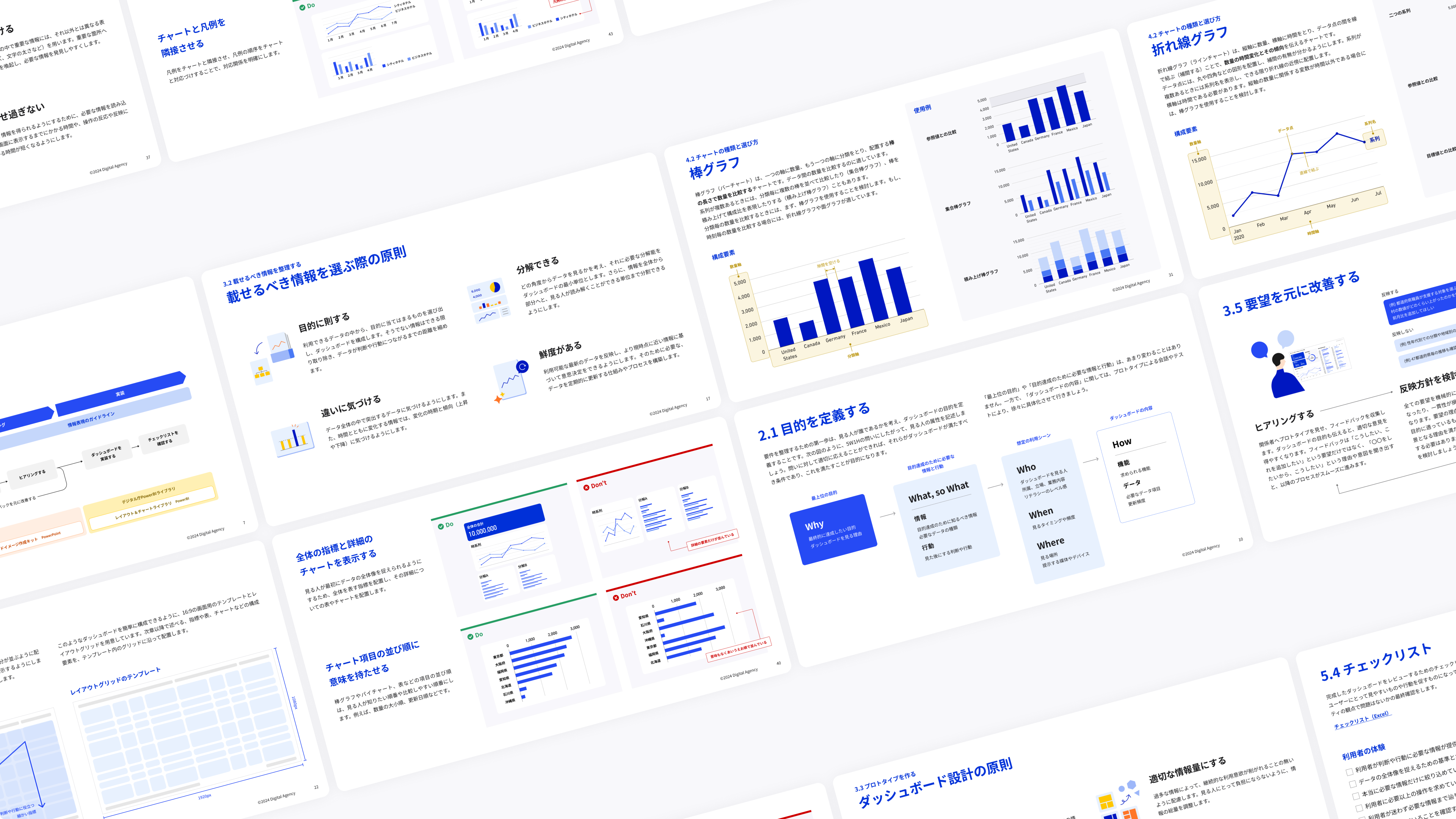
2.1 Dashboard quality and efficiency process
It introduces the process for improving and enhancing QCD (Quality, Cost, Delivery), including sorting out the requirements for the dashboard and building a consensus with project stakeholders through the prototype.
2.2 Information expression contributing to viewers' behavior and decision-making
It introduces information expressions (layout, graph expression, etc.) and Do's (desirable expression) / Dont's (undesirable expression) that are necessary to encourage people to make decisions and change their behavior, such as expressions that allow the viewer to know what they want to know and do not cause misunderstanding.
3. Download Practical Guidebook
- Dashboard Design Practice Guidebook (Updated March 31, 2026)
Relevant material in the Guidebook
Related materials included in the Practical Guidebook can also be downloaded from the following locations.
- Requirements Definition Worksheet (PPT / 572 kb)
- Prototyping Tool (PPTX / 1,481 kb) (updated on March 31, 2026)
- User Manual (PDF/2,855 kb) (updated on March 31, 2026)
- Checklist (Excel / 34 kb)
- Abstract Text Format (Word / 25 kb)
4. Template Characteristics
4.1 No design fine-tuning required
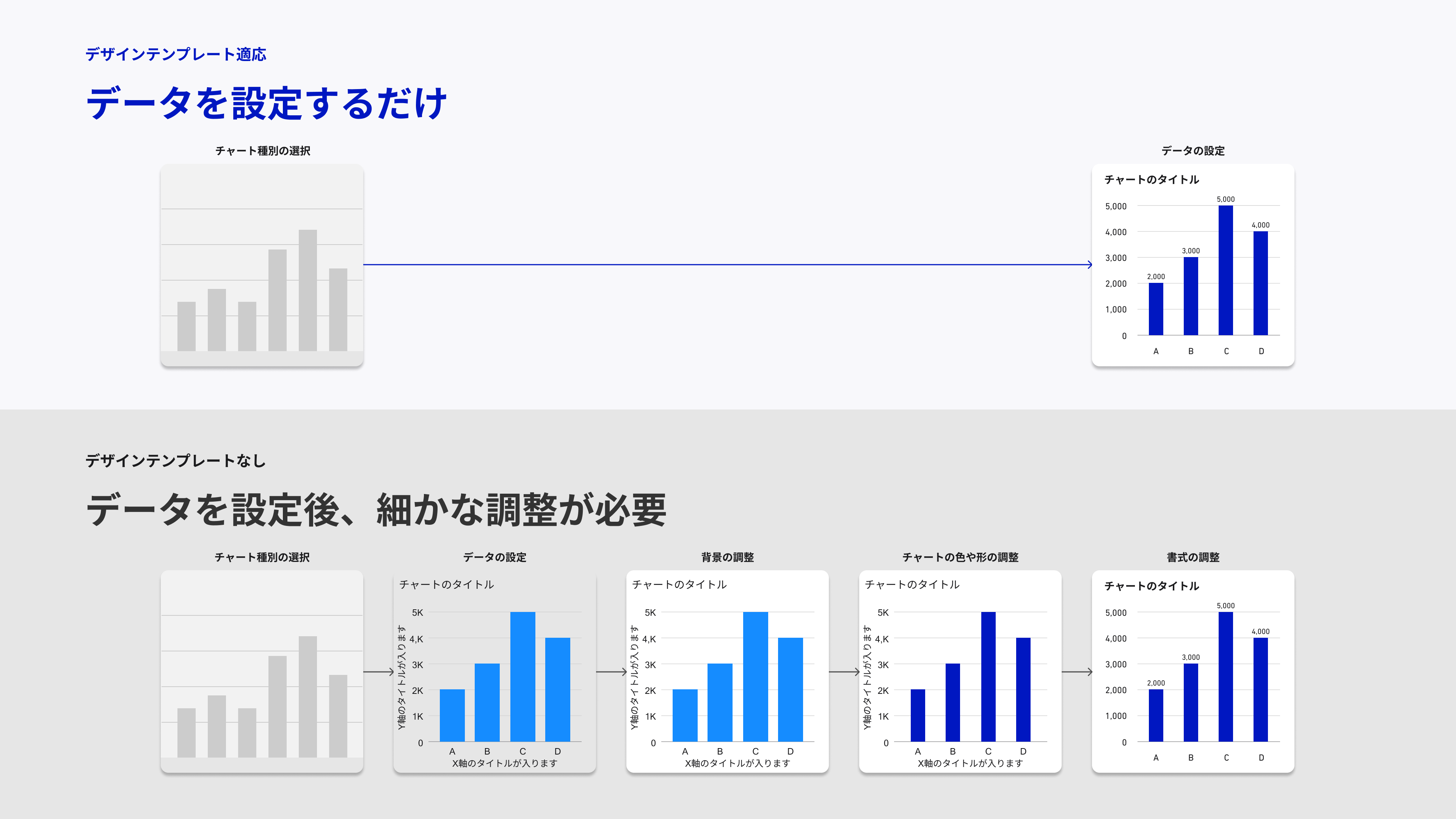
As a Power BI template, you can create a dashboard with a unified design without fine-tuning the background, charts, and formatting. You can also copy and paste chart samples (bar charts, line charts, pie charts, etc.) and use them to streamline the dashboard development process.
4.2 Easily create an organized layout
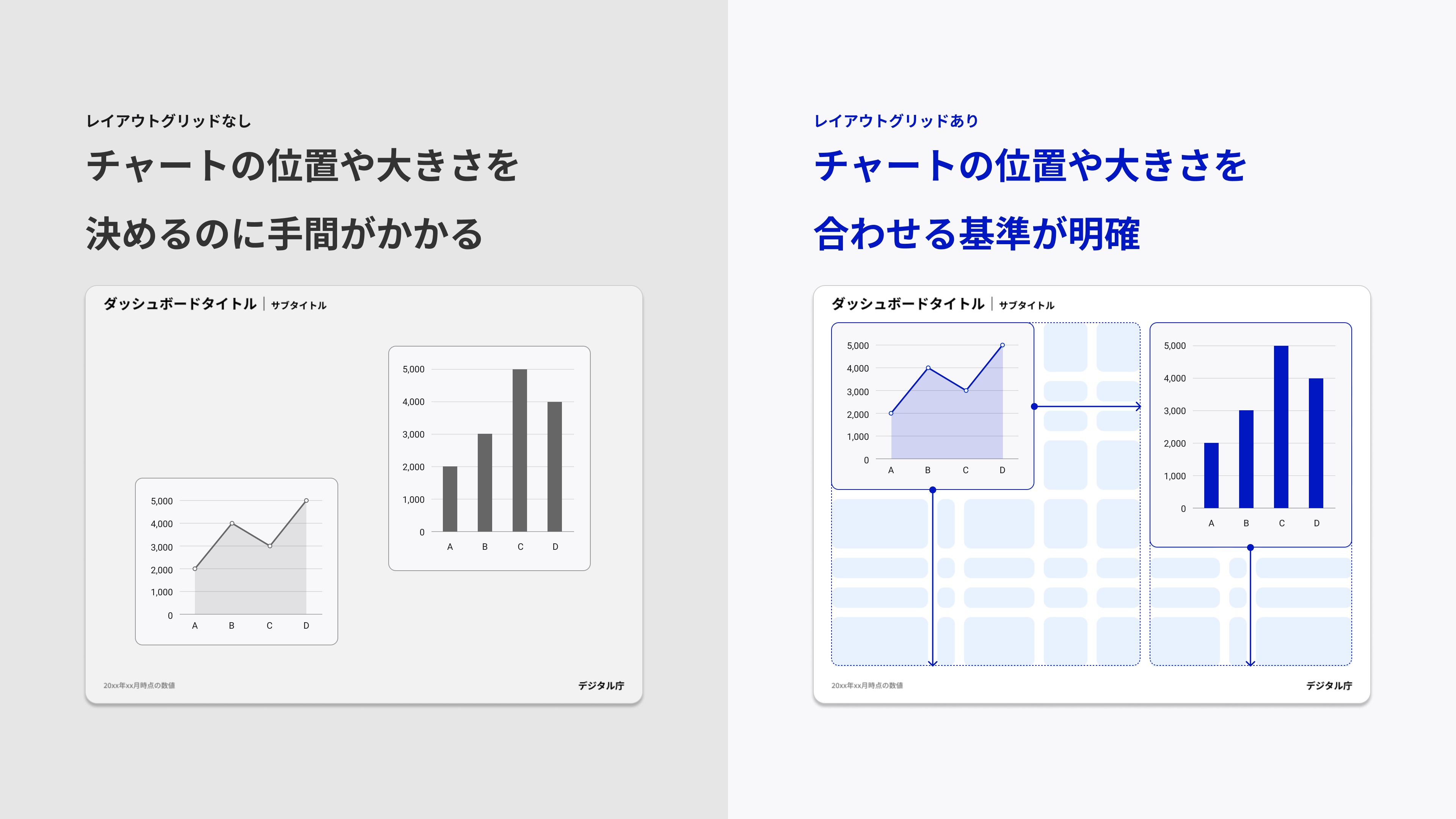
To help anyone organize and arrange charts, we provide a grid system that serves as a basis for layout. You can create a dashboard with an easy-to-read layout by simply arranging charts to fit the grid.
4.3 Choose from a 7-color palette
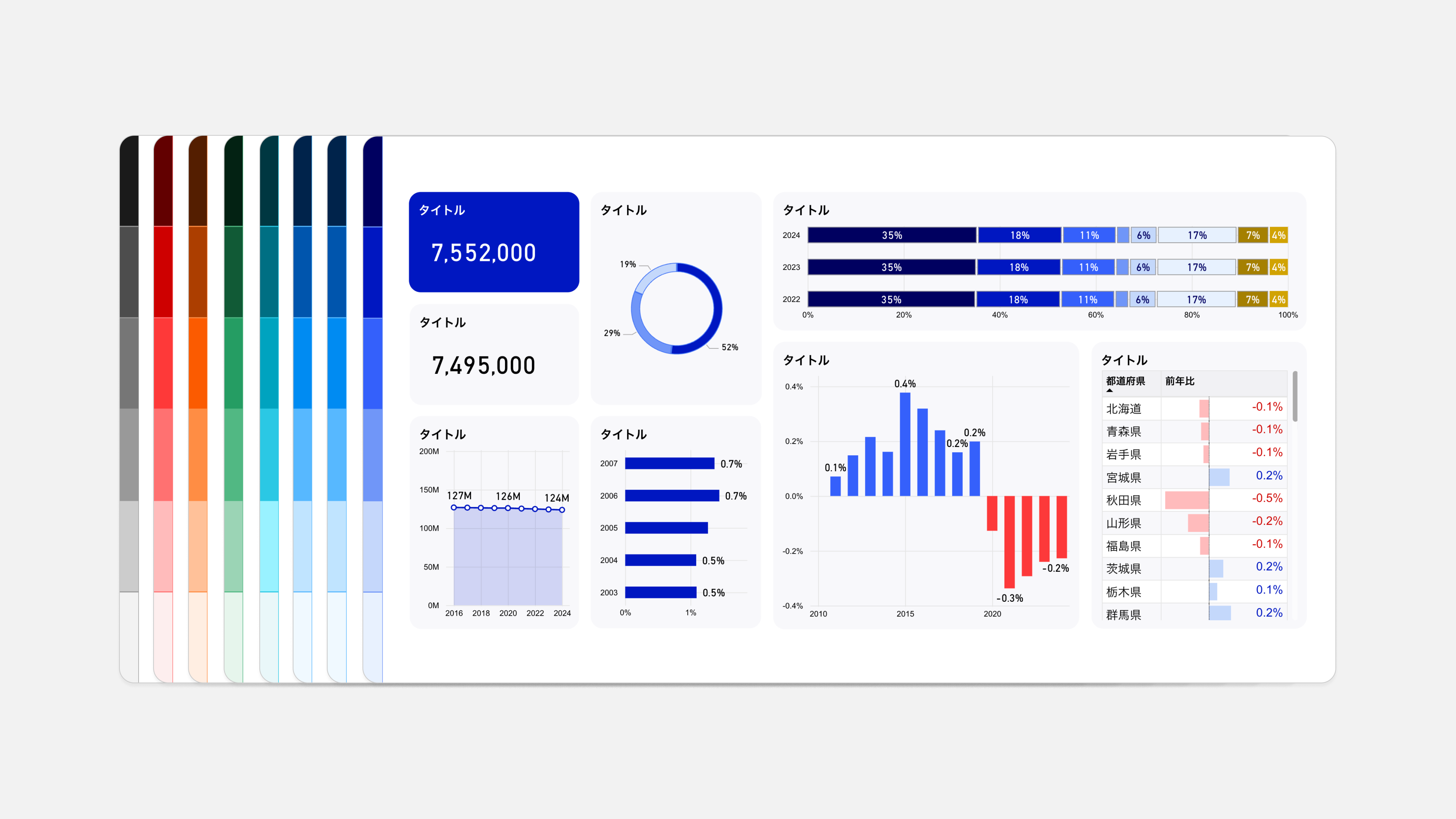
A total of seven color palettes are available: Solid Gray, Blue, Light Blue, Cyan, Green, Orange, and Red. The configuration of each color palette, the colors used in the dashboard (text, background, chart, increase / decrease expression, etc.), and the dashboard image to which the color palette is applied are introduced below.
5. Download Template
You can download the dashboard design template below. (* It is distributed as a pbit file that can be used with Power BI.)
- Design Template (SolidGray _ 1 _ 0 _ 0) (ZIP / 835 kb)
- Design Template (Blue _ 1 _ 0 _ 0) (ZIP / 835 kb)
- Design Template (LightBlue _ 1 _ 0 _ 0) (ZIP / 836 kb)
- Design Template (Cyan _ 1 _ 0 _ 0) (ZIP / 836 kb)
- Design Template (Green _ 1 _ 0 _ 0) (ZIP / 836 kb)
- Design Template (Orange _ 1 _ 0 _ 0) (ZIP / 836 kb)
- Design Template (Red _ 1 _ 0 _ 0) (ZIP / 836 kb)
The JSON file applied to the template can be found at:
6. Design Application Examples
Examples of the application of this guidebook and design templates are presented.
Government ministries and agencies
- Japan Dashboard (Digital Agency)
- Policy Dashboard (Digital Agency)
- Local Government Frontyard Reform Dashboard - Ministry of Internal Affairs and Communications
- Local standardization of local government systems Dashboard (Ministry of Internal Affairs and Communications)
- My Number Card Grant Status Dashboard (Ministry of Internal Affairs and Communications)
- "National Survey on Academic Ability and Learning" by Ministry of Education, Culture, Sports, Science and Technology National Institute for Educational Policy Research
Local government
7. Examples of Utilization
Using the "Dashboard Design Practical Guidebook" and "Design Template" published by Digital Agency, it introduces how data visualization and work improvement are promoted in the field of administration, along with specific examples.
8. comments and requests
Please send any questions or ideas from , comments and requests, .